Data Blast

Data, Telecom, Maths, Astronomy, Origami, and so on


Leave a comment

Going off the subject: GPS tracks, Travel times and Hadoop

It’s been a long time since my last post and I sincerely thought I wouldn’t update my blog again. I had many ideas and wanted to publish some results, or inclusive reflections about some books I had read, but then as always it happens to me, after an initial exploratory analysis, some certainly very promising and interesting, I couldn’t find the time to pursue the subject. Unfortunately the time is inevitable, at least not in relativistic terms, and then a new issue caught my attention and the former lost interest and so on; I have many inconclusive files in Python and R that will be forgotten in my hard drive, although not everything is lost, because in the way, I’ve learnt many things, new techniques, etc, and this is what is important, at least for me!!!! Moreover, then you can always recycle code for a new project, because there’s no need to reinvent the wheel every time. So, in the last months I’ve spent time fighting against so dissimilar datasets (or topics) that go from Ligo Project (Laser Interferometer Gravitational-Wave Observatory) to Dublin Bus traffic frequency, passing through raster analysis for precision agriculture .

ligoc

Digressions

When in February of this year the press reported the detection of gravitational waves produced by the collision of two black holes, which proved an old theory of Einstein, I had the need to research the matter. I was curious to know what gravitational waves were and how scientists could prove their existence. This also reminded me when around 2012 CERN confirmed the existence of the Higgs boson, a fact without precedent, that helped to complete the standard model of particle physics. It’s interesting as a conjecture based on mathematical abstractions (e.g. it needs “something that has mass” that helps to establish equality in an equation) that can then be confirmed by means of measurements with sophisticated instruments several years later. The same happened with the theory of relativity and the total eclipse of 1919. Another day I read that the same CERN had possibly discovered a new particle but I understand that this time, there wasn’t a previous theory to prove, they found differences in the masses in a measurements and that this could be explained by the existence of a new particle. According to scientists this discovery could prove the existence of “extra space-time dimensions” or explain “the enigma of dark matter”. It’s a recent fact and it must be confirmed because it may be a measurement error, but I thought immediately, this is a curious fact, probably for scientists engaged in these topics not too much, but for a novice reader like me, I expected an “experiment confirms etc etc” and not, “we found something” and there is no previous theory that explains it. Surely with large projects being developed nowadays (LIGO, ALMA, LHC, E-ELT, etc) and many others coming in next few years, technicians will advance to theorists.

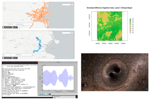
Well, in any case, I entered on Ligo Open Science Center website and discovered an extraordinary material and python codes to dive into the world of gravitational waves. Obviously, it’s necessary to be a physicist to understand everything, but for me the interesting issue was the use of the interferometry to detect variations in the signals. It’s incredible how with all instruments (in terms of calibration, I mean) they are able to isolate (filter) seismic, thermal and shot noise at high frequencies to analyse finally the “real” signal. Here the most important thing is to analyse time-series (e.g. time-frequency spectrograms analysis) applying cross-correlation and regression analysis in order to reduce RSM (SNR signals) or using Hypothesis testing (the typical mantra “to be or not to be”), signal is present vs signal is no present?, alignment signals, etc.  Anyway, I did some tests and tried with some “inspiral signals”, i.e. “gravitational waves that are generated during the end of life stage of binary systems where the two objects merge into one” but I don’t have time. I love this, maybe I got the wrong profession and I should study Physics, but it’s too late. In any case, it’s interesting to use of HDF5 file format (and h5py package) that allows to store huge amounts of numerical data and easily to manipulate that data from NumPy arrays.

With regards to raster analysis, I was interested in a project that used UAVs (Unmanned Aerial Vehicles)  or drones in order to analyse the health of a crop (See this news ). The basic example in this area is to work with multispectral images and calculate for example the Normalised Difference Vegetation Index (NDVI). In this case, using a TIFF image from Lansat 7 (6 channels), it’s easy to calculate NDVI using band 4 (Near Infrarred, NIR) and band 3 (Visible Red, R) and applying the formula: NDVI=(NRI-R)/(NIR+R). Simply, 0.9 corresponds to dense vegetation and 0.2 nearly bare soil. Beyond this, I wanted to learn how to develop a raster analysis using R (raster, rasterVIS and rgdal packages).


Finally, regards to Dublin Bus traffic, I only did an basic exploratory analysis of the data from Insight project available on Dublinked. In this dataset it’s possible to see different bus routes (geotagged) during 2 months. I simply cleaned data with R and then I used CartoDB to generate an interactive visualisation. It’s interesting to see for example some patterns in the routes or how they change due to some problems or how the last bus in the day does a shorter path, only to city centre, etc. Maybe I come back to this dataset, although I expect that Dublin City Council releases a new data version, current version is 2013. (See example Bus 9, 16-01-2013).

https://andrer2.cartodb.com/viz/b1fb9502-16df-11e6-8ab8-0e674067d321/public_map

GPS tracks

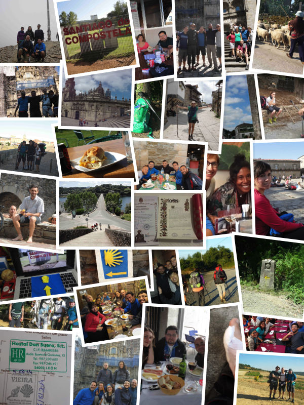
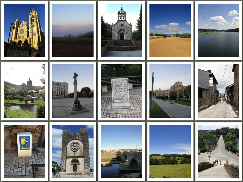
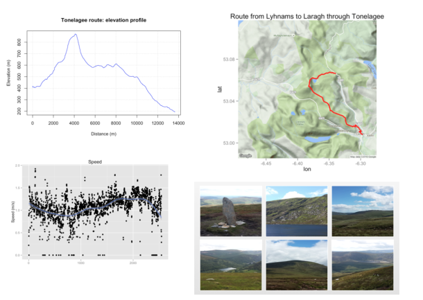
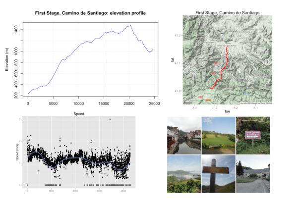
Also, I was working in others topics as for example analysing GPS tracks with R. I had two GPS tracks that gathered with my mobile phone and My tracks app during a walk around Tonelagee mountain in Co. Wicklow and another in the first stage of the Camino de Santiago, crossing Pyrenees. The R code can be found on this Rpubs

tone4

ronce5

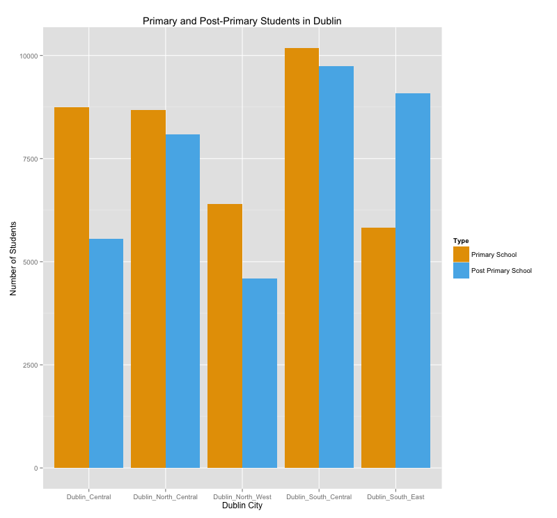
Travel Times in Dublin

Searching on Dublinked I found an interesting dataset called “Journey Times” across Dublin city. Data were released on 2015-11-19 (just one day) from Dublin City Council (DCC) TRIPS system. This system provides travel times in different points of the city based on information about road network performance. The data correspond to different datasets in csv and KML format, which can be downloaded directly from this link.

DCC’s TRIPS system defines different routes across city (around 50) and each route consists of a number of links and each link is a pair of geo referenced Traffic Control Site (sites.csv). On the other hand, “trips.csv” is updated once every minute. Data configuration is considered as a static route data and provides a context for the real time journey details. The R code can be found on this Rpubs.

dublin_tt

Hadoop with Python: Basic Example

Thanks to Michael Noll website, I discovered that you can use native Python code for doing basic examples with Hadoop. Usually, the quintessential example is “Wordcount” and from there it’s possible to make small changes depending on your dataset and “voil\`{a}”: you have your toy Hadoop-Python example. I chose an old dataset used in a previous post. It’s about the relationship between Investors and companies in a startup fundraising ecosystem using data from Crunchbase (see IPython notebook).

Investor Startup
ns-solutions openet
cross-atlantic-capital-partners arantech, openet, automsoft
trevor-bowen soundwave
……. …….

In this example ns-solutions invests only in openet and cross-atlantic-capital-partners invests in three startups, arantech, openet and automsoft, and so on. The idea is to apply Hadoop MapReduce algorithm to count how many investment companies invest in each startup and which they are. In each line of the dataset, the first name is the investment company and the following names are its startups. I used a Virtual Machine based on Vagrant (Centos65, Hadoop 2.7.1).

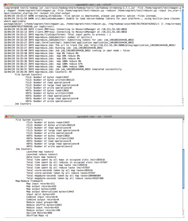
#Create a HDFS directory
hdfs dfs -mkdir inv_star-input
#Put dataset (txt format) into HDFS directory.
hdfs dfs -put investor_startup.txt inv_star-input/investor_startup.txt
#Execute Hadoop process.
hadoop jar /usr/local/hadoop/share/hadoop/tools/lib/hadoop-streaming-2.7.1.jar
-file /home/vagrant/test/mapper.py -mapper /home/vagrant/test/mapper.py
-file /home/vagrant/test/reducer.py -reducer
/home/vagrant/test/reducer.py -input
inv_star-input/investor_startup.txt -output star-output
#Show results
hdfs dfs -cat inv_star-output/part*

mapper.py

 #!/usr/bin/env python
import sys
#Input comes from STDIN (standard input)
for line in sys.stdin:
#Replace commas
line =line.replace(',','')
#Remove whitespace
line = line.strip()
#Split the line into names of companies
startup = line.split()
for i in range(len(startup)-1):
#Print all Startups for each Investment Company
print '%s\t%s' % (startup[i+1], startup[0]) 

reducer.py

#!/usr/bin/env python
import sys
from collections import defaultdict
#Defining default dictionary
d = defaultdict(list)
#Input comes from STDIN (standard input)
for line in sys.stdin:
#Remove whitespace
line = line.strip()
#Split the line into Startup and Investor
startup, company = line.split()
#Filling defaultdict with Startups and their Investors
d[startup].append(company)

for i in range(len(d)):
#Print all Startups, Number of Investors, Name of Investors
print '%s\t%s\t%s' % (d.keys()[i],len(d[d.keys()[i]]),d[d.keys()[i]])

col1
col2
Books

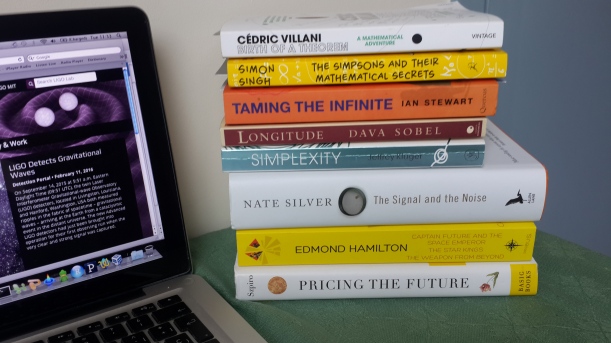
See below the picture of my latest book purchases. Currently I’m reading “Birth of a Theorem: A Mathematical Adventure” by Cèdric Villani (Fields Medal 2010) , I have good feelings although for moments it’s a little bit indecipherable in some concepts. I must say that previously I investigated about Boltzmann equation in order to enjoy the book. Anyway, so far it’s not so clear in ideas as “A Mathematician’s Apology” by G.H Hardy (a classic,1940), although I’m willing to give it a chance.

Well, my idea, however, is only comment briefly two books. “Simplexity” by Jeffrey Kluger disappointed me because this book has not good references and bibliography and sometimes turns on obvious things. It’s true that you learn about human behaviours, but I really expected more. In fact, I bought this book exclusively for its chapter 4: Why the jobs that require the greatest skills often pay the least?, Why do the companies with the least to sell often earn the most?. In short, using or no “U complexity analysis”, it’s clear that many bosses and companies (job market in general) don’t appreciate the complexity about many jobs, It’s somewhat disappointing. Finally I recommend reading “Pricing the Future” by  George G. Szpiro. For anyone who wants to learn about mathematics apply to finance is an excellent starting point.  Previously to this book my knowledge about Black-Scholes equation was anecdotic and I liked how writer mixes history with mathematical concepts.  The other books are excellent as “The Signal and the Noise”, already a classic in prediction, etc.

books


Leave a comment

Lies, Damned Lies, and Statistics – and Visualisation

By chance days ago, I met again with the famous Anscombe’s Quartet, which in case anyone doesn’t know or remember, corresponds to four datasets that seem to be identical when they are examined using simple summary statistics, but our perception changes considerably when they are analyzed visually, i.e. through “graphs”.

Group 1 Group 2 Group 3 Group 4
x1 y1 x2 y2 x3 y3 x4 y4
10 8.04 10 9.14 10 7.46 8 6.58
8 6.95 8 8.14 8 6.77 8 5.76
13 7.58 13 8.74 13 12.74 8 7.71
9 8.81 9 8.77 9 7.11 8 8.84
11 8.33 11 9.26 11 7.81 8 8.47
14 9.96 14 8.10 14 8.84 8 7.04
6 7.24 6 6.13 6 6.08 8 5.25
4 4.26 4 3.10 4 5.39 19 12.50
12 10.84 12 9.13 12 8.15 8 5.56
7 4.82 7 7.26 7 6.42 8 7.91
5 5.68 5 4.74 5 5.73 8 6.89

p_stat2

x1 y1 x2 y2 x3 y3 x4 y4
Average 9 7.5 9 7.5 9 7.5 9 7.5
Variance 11 4.12 11 4.12 11 4.12 11 4.12
Correlation 0.816 0.816 0.816 0.816
Linear Regression y1=0.5 x1 + 3 y2=0.5 x2 + 3 y3=0.5 x3 + 3 y4=0.5 x4 + 3

Doing some history, in 1973 the statistician Francis Anscombe in his paper “Graph in Statistical Analysis” presented this construction in order to show the essential role that a graph has in a good statistical analysis, for example, to show the effect of outliers over statistical measurements. It’s revealing, however, to observe how he described the situation of the statistics at that time: “Few of us escape being indoctrinated with these notions: 1) Numerical calculations are exact, but graphs are rough, 2) For any particular kind of statistical data there is just one of set of calculations constituting a current statistical analysis, and 3) Performing intricate calculations is virtuous, whereas actually looking at the data is cheating”. Nowadays however it seems to be a “graph” paints a thousand “numerical calculations”; anyway, a simple moral of all this could be that seeing the four graphs, it isn’t possible to describe reality with only an unique statistical metric and so the use of graphs is key to present information more accurately and completely. In a certain sense, summary statistics don’t tell the whole story.

On the other hand and with some relation to the latter, a great quote attributed to former British Prime Minister Benjamin Disraeli, now it comes to my mind: “There are three kinds of lies: lies, damned lies, and statistics”. Actually it’s a great joke, still valid, specially when we think about the politicians which sometimes use statistical values (biased or nonsense) as “throwing weapon” to support their weak arguments. Unfortunately it isn’t an exclusive area to politics because also the press sometimes falls into excesses when use statistical values incorrectly to describe a fact. As Mark Twain said: “Facts are stubborn, but statistics are more pliable”. The truth is that today (and always, actually) there are many interests involved and the line of the ethics and independence is sometimes too fuzzy for some eyes. This reminds me of the book “A Mathematician reads the Newspaper” by John Allen Paulos where the author tries explaining the misuse of maths and statistics in the press. I don’t know if the author has had success in his crusade to evangelize to readers of newspapers, but it’s clear that people with notions about maths or statistics will perceive more critically a determine news and so will demand more accuracy to the journalists.

At this point and although I’m straying slightly from the topic, I recommend reading the editorial of The Guardian (29th January 2015) and subsequent comments on the use of statistics in political debate. The editorial highlights that “Big data doesn’t settle the big arguments. Too many of the statistics thrown around reflect nothing but noise, confusion or damned lies”. It’s true that the arguments presented in this report make sense although they don’t say in general anyhing new, but it’s important, I think, to note that the problem itself isn’t in the data source, assuming that source is reliable like UK Statistics Authority, but in the data interpretation (or vision, say) which it could be sometimes too selfish, simplistic and biased. With this I mean the misuse of statistical values in the press because I guess data related to census or health statistics are reliable in terms of calculus and methodologies. In this sense Hethan Shah, Executive director, Royal Statistical Society commented about how we can improve the quality of public debate using statistics: “Three things would help. To ensure transparency, government should publish the evidence base for any new policy. To build trust, we should end pre-release access to official statistics, whereby ministers can see the numbers before the rest of us. And to build capability, politicians and other decision-makers in Whitehall should take a short course in statistics, which we’d be more than happy to provide”. Well, another interesting post related to this was written by Matt Parker: “The simple truth about statistics”.

Coming back to the issue, times have changed and many events have happened since 1973, but the persuasive power of numbers hasn’t changed and remains as an key element in any presentation, as well as, the use of visualisation in order to produce an immediate impact in the client, audience, etc. In this sense, I don’t know if in some newsrooms exists the slogan: “Don’t let a graph ruin great news (fake news, I mean)” although sometimes seems to be that this happens. Anyway, visualisation is mainly to convey information through graphical representations of data. You can use visualisation to record information, analyze data to support reasoning (e.g. visual exploration, find patterns and possible errors in data), and communicate information to others in order to share and persuade by means of a visual explanation. Harvard University offers a visualisation course, which unfortunately isn’t free but those lecture slices and videos are available for everyone at this moment.

Anyway, surely I’m talking nonsense and mixing things but my intention in this post was mostly to refer to some ideas, websites or books that are related to the proper or improper use of statistics and visualisation. Actually my goal was just to write a basic reflection about statistics and visualisation . Now I’d like to refer to some interesting things:

  • An hilarious website is “Spurious Correlation“. According to Business Dictionary: “a mathematical relationship between two variables that don’t result from any direct relationship, but is wrongly inferred to be related to each other. The false assumption of correlation may be attributed to coincidence or to another unseen factor”. Here you can find crazy and funny correlations, but it’s important to remember that “correlation doesn’t imply causation”.

p_stat1

  • WTF visualisation is another website to take into account in order to avoid repeating the same errors. They define their website as “visualisations that make no sense” but actually these are a lot of poorly conceived graphics. The focus is more related to infographics (i.e. graphic visual representations of information, data or knowledge) than graphs generated by R or Matplotlib; I mean it isn’t a simple graph such as a line, scatterplot or bar chart. Here, say, you have freedom to use colors and shapes; there is no limit to imagination and creativity and usually you condense much information in a small space, which can result the representation is unintelligible. Now, a key point is when the scales are modified giving an erroneous idea of magnitude. Also some 3D representations can produce the same effect because distort areas depending on point of view.

wtf_graph

  • To learn about visualisation and its design principles, there are many books but always it’s appropriate to revisit the classics: Edward Tufte, overall. He wrote: “Graphical excellence is the well-designed presentation of interesting data – a matter of substance, of statistics, and of design”. “Graphical excellence is that which gives to the viewer the greatest number of ideas in the shortest time with the least ink in the smallest space”. “Clutter and confusion are failures of design, not attributes of information”. “Cosmetic decoration, which frequently distorts the data, will never salvage an underlying lack of content”. Also are the books of Nigel Holmes and Alberto Cairo although I’m not very familiar with them. Information about E.Tufte and his work click here.
  • Visual Complexity Blog by Manuel Lima. He has a beautiful book call “Visual Complexity: Mapping Patterns of Information” which compiles a series amazing graphs.

To sum up, I’d say: “Use statistics accurately and visualisation in moderation”


Leave a comment

Dublin: Venture Capital Fundraising (by using Crunchbase)

Taking advantage of the Python and R scripts that I developed in a previous post, I wanted to learn about the state of the art of the companies in Dublin according to Crunchbase (APIv2). It’s true however that Crunchbase, and other similar websites, can give an incomplete vision about the companies in a specific city and on the other hand, this information, sometimes, is a bit biased, because they themselves manage, as it’s logical, what information want to show to potential investors and what not. In any case, it’s a good starting point to glimpse the technological potential of this city, where by the way, are many of the largest software companies worldwide. In this sense, I wanted to know some things related to “business ecosystem” of Dublin as the following ones: Which are the companies that have received more investments in the last years?, Who are the main investors?, Which is the order of magnitude of the investments?, Which are the most important business areas (“categories”) in the city?, etc.

An aspect to highlight in Crunchbase is that the companies indicate one or many categories (or fields) where their businesses are developed, so, there isn’t an unique “tag” that describes a company. However, some companies for example don’t choose the category “startup”, but in their descriptions they consider themselves as “startups”. On the other hand, doing a search for Dublin city, I gathered 1227 companies where only 186 included information about their investments, i.e. they mentioned investors and funding, although sometimes a “undisclosed amount” was considered as zero EUR. Furthermore, some companies like Mongodb-Inc, maybe must be considered as “outliers” or an unrepresentative company, because in this case, Mongodb’s Headquarter is in New York city, but its EMEA Headquarter is exactly in Dublin city. So, it’d be necessary to improve the search with filters more accurate to avoid this situation. Unfortunately, GPS coordinates are “missing in action” in the system and they must be generated directly using the addresses of the offices. I’ve a pending Python script via geopy to generate a new column with lat/long coordinates.

Anyway, the following figure shows a network graph with only 186 companies (“blue nodes”), 211 investors (“orange nodes”), and 534 links. Visually it may seem less links due to some investors are involved in several funding rounds with a same company, for example. Here ithere s a javascript chart.

dublin_graph1Perhaps, a Sankey diagram could be suitable to represent the connections between companies and investors because the width of the arrows is proportional to the investments which give us a clear idea about flow investment in Dublin. However, they are many companies and investors and the whole diagram is a bit confusing, so I only show a couple of companies/investors. By the way, this type of diagram is mainly used to visualize energy or material or cost transfers between processes. Here there is a javascript chart.

dublin_graph2Some Results:

a) Total Fundraised vs Year

graph3

b) Top 10 Companies

Company Total Fundraised
mongodb-inc EUR 214,922,988.84
green-apple-media EUR 122,760,000.00
mainstream-renewable-power EUR 120,000,000.00
gc-aesthetics EUR 83,700,000.00
intune-networks EUR 46,732,497.21
opsona EUR 40,277,993.28
sumup EUR 30,689,999.07
brandtone EUR 23,999,997.00
3v-transaction-services EUR 23,715,000.00

(*) Mongodb-Inc can be considered an “outlier”.

c) Top 10 Inversors

Investor Investment
marubeni-corporation EUR 100,000,000.00
robert-abus EUR 94,860,000.00
montreaux-equity-partners EUR 46,500,000.00
enterprise-ireland EUR 40,920,020.65
delta-partners EUR 35,554,481.07
sequoia-capital EUR 33,479,998.14
fountain-healthcare-partners EUR 33,271,332.38
robert-abus-2 EUR 27,900,000.00
intel-capital EUR 26,615,047.83

d) Main Categories

dublin_graph4  e) Degree and PageRank

By using Igraph for R, it’s possible to see the different connected components in the whole graph. This is an example:

dublin_graph5

 
Compamy Investor Type Investment Currency Year
sumup life-sreda venture 4030000 EUR 2014
sumup bbva-ventures venture 4030000 EUR 2014
sumup groupon venture 4030000 EUR 2014
sumup ta-venture undisclosed 0 EUR 2012
sumup bbva-ventures venture 0 EUR 2013
sumup groupon venture 0 EUR 2013
sumup klaus-hommels venture 4650000 EUR 2012
sumup tengelmann-ventures venture 4650000 EUR 2012
sumup shortcut-ventures-gmbh venture 4650000 EUR 2012
sumup brainstoventures venture 4650000 EUR 2012

Two charts that relate Funding with metrics like degree and pagerank.

degree_r

pagerank_r


Leave a comment

Next Stop Dublin: Public Libraries, Supermarkets and Voronoi Diagrams

I’ve been living in Dublin for only a couple of weeks and I’d like to write a post related to the city. In these few weeks I’ve visited some places that have surprised me pleasantly, as for example: The Trinity College Library with its “Book of Kells“, the huge Phoenix Park with its deers, and the Science Gallery and its interesting temporal exhibitions. In the surroundings of the city I visited the Celtic Boyne Valley (Trim castle included or “Braveheart” castle) and had the opportunity, for first time, to face the “Irish Bog” in the Seahan mountain near to Tallaght. So, I’d like to say simply I’m delighted with the city and its people. Moreover, it’s a very active city in IT issues with several meetups that worthwhile to consider such as: DublinR, Python Ireland, Hadoop User Group Ireland, DublinKind, and Big Data developers Dublin. A special mention is for Chapters Bookstore, a great find. collageDub Dublin Data As a newcomer to the city, I wanted to know where are located some key sites such as supermarkets or public libraries and therefore I got ready to build a map of locations with its respective Voronoi diagram in order to visualize the area of coverage or influence of each point. According to Wolfram MathWorld, a Voronoi diagram is “a partitioning of a plane with points into convex polygons such that each polygon contains exactly one generating point and every point in a given polygon is closer to its generating point than to any other. A Voronoi diagram is sometimes also known as a Dirichlet tessellation. The cells are called Dirichlet regions, Thiessen polytopes, or Voronoi polygons”. In order to find GPS coordinates in the case of the supermarkets I used a Python script to connect Yelp APIv2. I don’t know which is the problem with Yelp API, but I only could gather 1000 of 1153 points that Yelp search browser indicates and which 442 supermarkets are really in the Dublin city area. In the case of the public libraries I used “geopy” package, which geo-locates a query to an address and coordinates. In both cases, I must say there are some differences in the real position of some places, but as proof of concept, for me it’s OK. As Dublin City area I considered the five areas described in the city website:

  1. Central Area: This includes Broadstone, North Wall, East Wall, Drumcondra, Ballybough and the north city centre.
  2. North Central Area: This includes Kilbarrack, Raheny, Donaghmede, Coolock, Clontarf and Fairview.
  3. North West Area: This includes Cabra, Ashtown, Finglas, Ballymun, Santry, Whitehall, Glasnevin, the Phoenix Park and parts of Phibsborough.
  4. South Central Area: This includes Ballyfermot, Inchicore, Crumlin, Drimnagh, Walkinstown, The Liberties and the south west inner city.
  5. South East Area: This includes Rathmines, Rathgar, Terenure, Ringsend, Irishtown, Pearse Street and the south east inner city.

Additionally and as proof of concept again, by means of Dublinked (Open Data) and AIRO, I got two datasets with information about Primary and Post-Primary schools in Dublin city (census 2013-2014). My idea was for example to know how many students are studying in a particular area of the city or how many students are assigned, say, to a specific library (Voronoi polygon). In the case of Post-Primary schools dataset, school coordinates are in UTM coordinates, so it’s necessary to apply a transformation to GPS Coordinates (e.g. CRS(“+init=epsg:29902”) to CRS(“+init=epsg:4326”)). The datasets contain information (2013-2014) about school ethos or separation by gender but I was only interested in total values. In this Github, you can find kml and csv files. Some example:

library(deldir)
library(ggplot2)
library(ggmap)
library(sp)
library(rgdal)
library(maptools)

#Load data with GPS coordinates for Public Libraries in Dublin City 
df <- read.csv("t_lib.csv",header = TRUE, sep = ",",stringsAsFactors=FALSE)

# Voronoi data
vor <- deldir(df$long, df$lat)

# Creating Voronoi polygons
w = tile.list(vor)
polys = vector(mode='list', length=length(w))
for (i in seq(along=polys)) {
 pcrds = cbind(w[[i]]$x, w[[i]]$y)
 pcrds = rbind(pcrds, pcrds[1,])
 polys[[i]] = Polygons(list(Polygon(pcrds)), ID=as.character(i))
 }
SP = SpatialPolygons(polys)
voro = SpatialPolygonsDataFrame(SP, data=data.frame(x=df$long,y=df$lat, row.names=sapply(slot(SP, 'polygons'), function(x) slot(x, 'ID'))))

#Generating DataFrame with polygons
pvor1=data.frame()
for (i in seq_along(voro)){
pvor2=SP@polygons[[i]]@Polygons[[1]]@coords[,1:2]
pvor2=as.data.frame(pvor2)
pvor2$ID<-df$name[i]
pvor1<-rbind(pvor2,pvor1)
}

#Ploting: Points, Polygons and Segments
dub_map <- get_map(location = "Dublin", zoom = 11)
ggmap(dub_map) + geom_point(aes(x = long, y = lat), data = df, colour = "blue", size = 3)+
geom_polygon(aes(x=V1, y=V2,group=ID,fill=ID),data=pvor1, alpha=0.3)+
ggtitle("Voronoi Polygons for Public Libraries in Dublin City")+geom_segment(
 aes(x = x1, y = y1, xend = x2, yend = y2),
 size = 1,
 data = vor$dirsgs,
 linetype = 1,
 color= "#FFB958")

Voronoi_Dublin In this RPubs you can find the RMarkdown file. Other plots. PS: Donaghmede Library has zero students because this library is out of Dublin City area according to the boundary defined (North Central kml), so surrounding schools were filtered. plot1_1 plot1 plot2 plot3 plot_schools_dens Also it’s possible to generate kml files for points, polygons and segments and put into googlemap.

Comments:

I’d like to comment that “deldir” R package uses the Lee and Schachter’s algorithm for Delaunay Triangulation; however, it’d be interesting to apply an algorithm (e.g. modifying Fortune’s algorithm, etc) that allows generating, say, a weighted Voronoi diagram since in the reality each library has different resources and opening hours and so it’s possible to use other metrics, beyond Euclidean distance. In fact, an interesting next step would be to review “Power diagrams” which are a generalization of the Voronoi diagrams.

As last comment, I want to recommend the book “Longitude” written by Dava Sobel. I know it’s old (1995), but that is also one of the reasons why I wrote this post; it was a kind of inspiration. Well, in short, it’s a true story of a lone genius who solved the greatest scientific problem of his time: measuring the longitude in the sea. It’s a story with a clear scientific background where it’s possible to learn different concepts related to navigation and geography. Moreover, it’s a story of overcoming and how jealousy, egos and ignorance complicate the scientific progress.


Leave a comment

Discovering RHIPE with SDN-Mininet

Some days ago I attended a series of lectures organized by Telefonica Research (TID) where they explained several projects that have been developing in the last years in the field of Big Data. These projects or use cases mostly are related to the use of data gathered from their mobile phone communications, besides other sources such as credit card transactions and social networks (e.g. twitter and facebook). In general, the talks showed interesting information both at content and format level.  In addition, two key concepts, as it might be expected, were mentioned repeatedly during the explanation: “anonymity” and “aggregation”, conveying that personal data they collected are protected, in order to ensure the privacy of their users. Although I don’t want to doubt about this, we must recognize that this is a controversial issue both for Telcos and OTTs and whose discussion isn’t over; still a lot of water under the bridge must flow in order to clarify the suitable use of personal data. I mean It’s necessary the existence  of a strict legal framework that protects users worldwide, but that’s another topic for another post.

Well then, I understand and guess that in general the focus of these talks was simply to present compelling and novel visualizations, so audience can glimpse the power behind the data and the endless options that the use of Big Data technology can bring us in the future. Visualizations such as the movement of Russian tourists or cruise passengers through Barcelona, where they sleep, eat or buy luxury items, food, etc, (all geo-located) or also sentiment analysis by means of twitter of a determined event, etc. etc. Also to mention some research projects with social scope where TID is involved in several countries as could be the analysis of crowd movement after an earthquake or during a flood, i.e. migration events. On the other hand, they highlighted also something very important and revealing: analyze the behaviour of people by means of their movements through cellular radio system (and social networks) provides a more accurate and less biased notion of the users (potential clients) than an opinion survey. Anyway, it gets the feeling that Big Data is a world of possibilities and as Henry Ford said: “If I had asked people what they wanted, they would have said faster horses”. See Smart Steps project by TID.

However, it’s logical to think all this is the tip of the iceberg of an emerging business that could be very lucrative: “sales data”…well in fact, it already is the case. This reminds me a news of October 2012 where Von McConnell, director of technology at Sprint said, in relation to if Telcos became nothing more than a dumb pipe, “we could make a living just out of analytics”, this is, Telcos can survive on Big Data alone. Besides, I remember last year at Telecom Big Data conference (Barcelona), Telcos were aware that they are “sitting” on a goldmine of data and already are working on mechanisms to get useful business information, at all level, with a main goal: data monetization. However, here I would like to mention briefly an aspect that can modify this scenario: there exists a war Telco vs OTT players for dominance over the data, but it’s another story which we must be alert. Anyway, currently some relevant topics in a telco are: marketing analytics, M2M solutions, voice analytics, operational management (network and devices), advertising models, recommendation systems (cross/ up selling) etc. This give us an idea about the topics that Telcos are currently working. By the way, I recommend to check Okapi project by TID (Tools for large-scale Machine Learning and Graph Analytics).

Configuring RHIPE and SDN-Mininet

Well, actually this preamble was only a pretext to present a simple example where is possible to see an application of Big Data & analytics tools (e.g. Map/Reduce Hadoop and R) over data gathered from a network. It’s true however, these are well-known issues that I already had mentioned in previous posts, but my intention this time (as well as to repeat my speech) is to place Big Data in a context purely of network. Typically when we talk about Big Data or analytics in a Telco, some common examples appear such as customer churn analysis or pattern analysis over a cellular radio system.  SDN (and NFV) in this sense, by decoupling control and data plane, offers a clear opportunity to manage network communications in a centralized way, with which now it’s possible to have server a farm (Data Center) that can process several network metric in real time using Big Data analytics, i.e. now can be possible to do an advanced network tomography: huge network matrix, delay matrix, loss matrix, link state, alarms, etc

Anyway… currently however, I don’t have access to real traffic data of a Telco, which would be ideal, but as proof of concept, a simple network created with Mininet is enough from my point of view. So, I programmed a tree-based topology with Python, with an external POX controller and a series of Open Flow switches and hosts. In this tree-based topology is possible to configure the fanout (number of ports) and some characteristics for the links such as bandwidth and delay. It’s very easy to add packet loss rate or CPU load, but this time I only used the first two features. Moreover, it isn’t very complicated to programme a fat-tree or jellyfish topologies or inclusive random networks, if you prefer to work with more complex networks.

On the other hand, I used wireshark tool to gather network data. In any case, I only want to capture ICMP packets in order to calculate simply the latencies between nodes and then construct a “Delay Matrix”. Actually this is very simple, but now all analysis will be done with RHIPE package, in order to apply a Map/Reduce & HDFS scheme. According to Tessera project: “RHIPE is a R-Hadoop Integrated Programming Environment. RHIPE allows an analyst to run Hadoop MapReduce jobs wholly from within R. RHIPE is used by datadr when the back end for datadr is Hadoop. You can also perform D&R (Divide and Recombine) operations directly through RHIPE MapReduce jobs, as MapReduce is sufficient for D&R, although in this case you are programming at a lower level than for datadr.” So, basically RHIPE is a R library that acts as “wrapper” which allows interact directly with Hadoop.

For Hadoop environment, I used Vagrant Virtual Machine by Tessera Project that includes CDH4 and RStudio.  My R Code is in Rpubs and csv file (traffic_wireshark.csv) is in Github.

Configuring Mininet  (see Github for test_tree.py)

# Loading wireshark
sudo wireshark &
# Filter ICMP (hiding Open Flow messages)
icmp && !(of) && ip.addr == 10.0.0.0/24
#Loading POX controller
~/pox$ ./pox.py forwarding.l2_learning
#Loading tree-based topology
sudo python test_tree.py
SDN Topology

SDN Topology

Screenshot wireshark

Screenshot wireshark

Map-Reduce Scheme

Map-Reduce Scheme

Delay Matrix

Delay Matrix


Leave a comment

Venture Capital Fundraising, Crunchbase, and Barcelona ecosystem

Inspired by two readings apart in time, I decided to write this post. The first one, just a couple of days ago, when browsing I found a talk from Etsy, an e-commerce website, for “Business of APIs Conference 2012”. There, they talked about the need to think an API (Application Programming Interface) as a product and not simply as an interface to allow connections to a data repository. They also explained that in the development of a new product many people are involved from different disciplines or areas within the company as designers, project managers, marketers, etc. In contrast, the development of an API is more limited or restricted to the IT department, with the risk of losing focus on its usability and functionality, i.e. a vision too technical, maybe. With this I don’t mean that it always happens, surely many things have changed to date, but it’s clear that technical and commercial insights sometimes go in opposite directions and today an API is a great opportunity to make business, connect with customers more easily, and also to enhance the visibility of the business.

The second reading is older and goes back a few months ago; March to be exact., when I read an interesting blog post from Beautiful Data site in which the authors analyzed the Big Data investment in technology in 2014 using data gathered from CrunchBase portal. Now, I remember I liked how they presented this issue and how used CrunchBase API (RESTful interface) in order to find relationships between companies and investors related to Big Data. Although the use of APIs wasn’t alien to me then, because I already had done some developments using APIs from Facebook and Flickr for sentiment analysis, but its approach, at least for me, it was very interesting and with a great potential for evaluating and analyzing investments into a startup ecosystem. So, I remember I checked out CrunchBase API documentation (version 1) and then I applied a series of Python scripts getting some results comparing for instance, startup ecosystems at Barcelona, London, and Paris. Although in this point, I must say that API version 1 wasn’t very robust, moreover some fields were somewhat ambiguous and the requests rather limited.

Back to the present and considering both “revelations”, I tried to dust off my old code in order to publish some results in my blog, but unfortunately CrunchBase API had migrated to version 2 and I was forced to rebuild the scripts completely. Well, finally after some hours fighting with Python, R and MongoDB reached my goal. I used MongoBD because CrunchBase limits its usage to 2,500 calls per day and 50 calls per minute and I needed to save the requests in order to reduce the traffic. Moreover, MongoDB is a robust Non-SQL DB, very easy to configure and works fairly good with JSON-like documents. As tip, there is a package called Python Crunchbase 1.0.2 that “in theory” works well with version 2 but personally I haven’t tried (uploaded 17/09/14). In any case, most of scripts that I used are in this IPython Notebook.

Some details

According to Wikipedia, CrunchBase is “a database of companies and startups, which comprises around 500,000 data points profiling companies, people, funds, fundings and events. The company claims to have more than 50,000 active contributors. Members of the public, subject to registration, can make submissions to the database; however, all changes are subject to review by a moderator before being accepted. Data are constantly reviewed by editors to ensure they are up to date. CrunchBase says it has 2 million users accessing its database each month”.

Now, it’s important to remember that each CrunchBase member fills the information that wants or considers appropriate, so it isn’t unusual to find companies with a bit of relevant information. On the other hand, now version 2 includes IDs (uuids) for all objects, which it’s a new advantage compared with version 1, however, still there are some details to debug. Also, when you write a script must be careful to include exceptions handling because requests are very sensitive when a field is empty or doesn’t exist, maybe because it wasn’t filled properly or was removed intentionally for the system, etc. Also, depending on your app, perhaps you want to search companies for a specific city and in this case a first answer for this query could be too broad, i.e. it could include companies from other cities. For example, if the query is for Barcelona (uuid), between the companies gathered appears Veeva whose global headquarters is in USA but has an office in Barcelona that is its European headquarters. In this case it would be necessary to apply some filter to avoid confusions specially when you want to analyze strictly startups in a city. Even so, all this depends on how a company is defined itself…I mean its category.

In Barcelona for instance, if you sort by location (Barcelona, uuid: eead2c0cb178ad334e6d6c813c955e99) and category (“Startups”, uuid: 568e63721763cf41d3f05a985edc3220) just get 15 startups, when in reality there are many more on the list that could be considered startups currently. Anyway, data quality will depend on what a company wants to show: funding round, fundraise, if the funding is undisclosed, private equity, etc. and it’s for this reason that data gathered should be considered only as something illustrative.

Some results for Barcelona Ecosystem

A) The following figure shows a VC fundraising graph where is possible to see the relationships between companies (690 orange circles, 145 connected) and investors (188 blue circles). In this case, the representation is an undirected and unweighted graph where some links could be parallel links between two nodes, i.e. a multigraph but visually we see only one link, this is, because there are investors that participate in different funding rounds with the same company.

For an interactive visualization click here.

For interactive visualization click here

Also, as an remarkable detail, there are 42 connected components, i.e. 42 subgraphs, where in each one of them, any two nodes are connected to each other by paths but not with others nodes in the “supergraph”. This last point is key because there exists a big component comprised by 220 nodes, 98 companies and 122 investors forming a significant investment group for the city. Depending on which information you want to get, it’s possible to define this scheme as a weighted directed graph (see IPython notebook), for instance to apply pagerank algorithm or in/out degree centrality algorithm.

B) Total Fundraised vs Year

For interactive visualization click here.

For interactive visualization click here.

C) Top 10 Companies

Company Total Fundraised
privalia EUR 395,668,000.00
desigual EUR 285,000,000.00
scytl EUR 89,427,998.42
strands EUR 43,450,000.00
groupalia EUR 35,899,996.00
social-point EUR 34,845,998.42
arcplan-information-services-ag EUR 26,907,400.00
ntr-global EUR 26,860,000.00
gigle-semiconductor EUR 24,489,998.42

D) Top 10 Investors

investor money
eurazeo EUR 285,000,000.00
cabiedes-partners EUR 203,989,256.00
index-ventures EUR 66,547,928.00
general-atlantic EUR 66,547,928.00
vulcan-capital EUR 31,600,000.00
insight-venture-partners EUR 29,022,928.00
sofina EUR 25,000,000.00
highland-capital-partners EUR 24,371,500.00
nauta-capital EUR 23,557,527.14

E) Total Fundraised vs Pagerank

By Networkx, “PageRank computes a ranking of the nodes in the graph G based on the structure of the incoming links. It was originally designed as an algorithm to rank web pages”.

For interactive visualization click here.

For interactive visualization click here.

F) Total Funraised vs Degree Centrality (in-degree)

by Networkx, “the in-degree centrality for a node v is the fraction of nodes its incoming edges are connected to. The degree centrality values are normalized by dividing by the maximum possible degree in a simple graph n-1 where n is the number of nodes in G.”

For interactive visualization click here.

For interactive visualization click here.

G) Percentage Category

For interactive visualization click here.

For interactive visualization click here.

The increase in the value for both Pagerank and Degree Centrality indicate also an increase in the position within of the fundraising ecosystem, i.e. conditions more favourable to get funds. So, it isn’t necessary to reinvent the wheel to know that having a greater and better connection to big investors gives advantages to a company when it seeks more funding. As Arthur Conan Doyle wrote in The Great Keinplatz Experiment: “Knowledge begets knowledge, as money bears interest” and this makes even more sense when we think for instance in a startup that is well connected in the network and possibly can have access to better mentors, new opportunities of fundings, etc.,although also it’s true this isn’t guarantee of success because many other factors must be considered surely. On the other hand, from investor point of view, the position in the network of a startup could be a decision parameter to invest, maybe.

Anyway, with this post my intention was to dust off my code and also to share some thoughts about APIs…better APIs attract more developers and therefore it’s possible to develop better products and new businesses…visualizations, data analysis and so on. As tip, this website gathers links to 531 reference APIs. Finally given the data, many other conclusions can be said, such as fashion is the industry that has received more investments (total fundraised) followed by the e-commerce or that 2014 is being the year with biggest investment, etc etc.  but as I mentioned before, these data should be compared with other sources in order to validate certain trends. My example of Barcelona maybe wasn’t very representative, because in Spain, I think CrunchBase doesn’t have a critical mass, yet, but it’s a matter of changing city and making other analysis. Also, there are many other investor matchmaking websites. For example, Angellist is a case that could be interesting to analyze. Furthermore, there are companies like SiSense that develop analytics dashboard software with this type of data, or websites like Startup Genome, Foundum, etc.

In my github repository are the csv files, so anyone can try VC Fundraising graph with R.

library(RCurl)
library(d3Network)
library(igraph)
library(rCharts)

d1 <- read.csv("barcelona_link.csv",header = TRUE, sep = ",",stringsAsFactors=FALSE)
d2 <- read.csv("barcelona_role.csv",header = TRUE, sep = ",",stringsAsFactors=FALSE)
d1<-unique(d1)
d2<-unique(d2)
links<-data.frame(d1$company, d1$investor)
colnames(links)<-c('source','target')
nodes<-unique(data.frame(d2$name))
colnames(nodes)<-c('name')
m=match(links$source, nodes$name)
g <- graph.data.frame(links, directed=TRUE,nodes)
dat1<-(data.frame(get.edgelist(g, names=FALSE))-1)
links$source<-dat1$X1
links$target<-dat1$X2
nodes['group']<-1
nodes$group[m]<-2
d3ForceNetwork(Links = links, Nodes = nodes, Source = "source", Target = "target", NodeID = "name",Group = "group",width = 550, height = 400, opacity = 2, linkColour = "#000000", zoom = TRUE,file = "b_new.html")


1 Comment

Remembering “The Way of St. James” ( and The_Way R Shiny App)

People say there is a before and after of “The Way”. I can’t make sure it’s true (for everybody), but I know that the way has something that catches the pilgrim. Although one exact month has already passed since my wonderful and exciting trip through the way of St. James (French way), I still keep thinking about it. For me, it was an extraordinary and vital experience where I met many people from different countries, all united by a common goal: to reach Santiago. I shared many experiences, joys and sorrows, wishes and hopes, some philosophical conversations and others more mundane, but mostly I met wonderful and endearing friends that until today, fortunately, I keep being in touch thanks to the email and WhatsApp.

When I started the way, of course, had many doubts and fears of what I would find there. A week before, I remember I read a quote, which initially didn’t pay much attention but during the path, I realized that it had all the sense: “The way is never long if beside you go a good friend”. This phrase I think encompasses the sense of the way, something like the hymn of Liverpool “You’ll never walk alone” haha Actually, I practice regularly trekking but for some reason, for several months I was not able to do it and my feet were the first to notice it: the fearsome blisters (which came to be raw, oops)…..simply I’m a rookie. Here I also must say that only thanks to encouraging words from kind travel-mates I was able to finish the journey and reach my initial goal.

p1_tw

Well, my intention, however, isn’t to mystify the way because each person will give the sense that he or she wants, but I must recognize that “The Way” isn’t an ordinary path, has “an aura” that makes it special. I mean, unlike other routes I’ve done, here there is a great willingness for talking and sharing and the only keyword to start a conversation is a simple phrase: Buen Camino!!!!. Moreover, in an astonishing way, language barriers disappear because you have all the time, people can practice the patience and the tolerance, and finally, somehow people understand each other; I myself was witness to idiomatic miracles like this. On the other hand, wonderful landscapes and monuments make this, a worthwhile adventure and an unforgettable experience despite the effort made. Hopefully, next year I wish to go back…maybe by the Northern way or French way again; only time will tell. Finally, from here, I’d like to send greetings to all my friends at the way: Italian team and friends from Seville, Navarra, Galicia, Canary Islands, France, Poland, etc. etc. Meanwhile, I’m practicing from now the hymn: “Tous les matins nous prenons le chemin, tous les matins nous allons plus loin……… Ultreia, ultreia et suseia.”.

p6_land

The_ Way R Shiny App

Coming back to the reality (or at least I’m trying), these last days I was considering to make a simple web app using R Shiny which is made up of three parts: Map, Altitude, and Distance. Map section shows the paths and some markers by using leaflet library and kml files. I should have liked to use mapbox.js library in order to control layers in the map, but I had problems in the integration with R Shiny. In the Altitude section, I used morris.js (rCharts package) and rgbif package based on Google Elevation API to calculate elevation from gps coordinates. Finally, Distance section shows a distance table for a specific site. Github link.

the_way_shiny

ui.R

library(shiny)
library(rCharts)
shinyUI(fluidPage(
    titlePanel("St. James's Way (The French Way)"),
    sidebarLayout(
    sidebarPanel(
    selectInput("var1", label = "Choose a Stage:",choices = s$id,selected = "stage1"),
    selectInput("var2",label = "Choose a Site:", choices = cam$Site, selected = "Saint Jean Pied de Port"),
        br(),
        br(),
        br(),
        br(),
        img(src = "camino.png", height = 72, width = 72),
        span("by Andre", style = "color:blue")
        ),
    mainPanel(
    tabsetPanel(
    tabPanel("Map", tags$style('.leaflet {height: 400px;}'),
    showOutput('mapPlot','leaflet')),
    tabPanel("Altitude", textOutput("text1"),showOutput("plot1", lib = "morris")),
    tabPanel("Distance",textOutput("text2"),tableOutput ("tab2"),tableOutput ("tab1"))
  )))))

server.R

library(shiny)
library(rCharts)
library(rMaps)
shinyServer(function(input, output,session) {
    dinput &lt;- reactive({switch(input$var1,,&quot;stage1&quot;= s1,&quot;stage2&quot;= s2,&quot;stage3&quot;= s3,&quot;stage4&quot;= s4,
    &quot;stage5&quot;= s5,&quot;stage6&quot;= s6,&quot;stage7&quot;=s7,&quot;stage8&quot;= s8,&quot;stage9&quot;= s9,&quot;stage10&quot;= s10,&quot;stage11&quot;= s11,
    &quot;stage12&quot;= s12,&quot;stage13&quot;= s13,&quot;stage14&quot;= s14,&quot;stage15&quot;= s15,&quot;stage16&quot;= s16,&quot;stage17&quot;= s17,
    &quot;stage18a&quot;= s18a,&quot;stage18b&quot;= s18b,&quot;stage19&quot;= s19,&quot;stage20&quot;=s20,&quot;stage21&quot;= s21,&quot;stage22a&quot;= s22a,
    &quot;stage22b&quot;= s22b,&quot;stage23a&quot;= s23a,&quot;stage23b&quot;= s23b,&quot;stage24&quot;= s24,&quot;stage25&quot;= s25,&quot;stage26&quot;= s26,
    &quot;stage27a&quot;= s27a,&quot;stage27b&quot;= s27b,&quot;stage28a&quot;= s28a,&quot;stage28b&quot;= s28b,&quot;stage29&quot;= s29,&quot;stage30&quot;= s30,
    &quot;stage31&quot;= s31,&quot;stage32&quot;= s32,&quot;stage33&quot;= s33)})
    output$text1 &lt;- renderText({s$name[s$id == input$var1]})
    output$text2 &lt;- renderText({input$var2})
    output$plot1 &lt;- renderChart({
        di&lt;-dinput()
        m2&lt;-mPlot(x=&#039;index&#039;,y=&#039;alt&#039;, type = &quot;Line&quot;, data = di)
        m2$set(pointSize = 0, lineWidth = 1)
        m2$set(hoverCallback = &quot;#! function(index, options, content){
        var row = options.data[index]
        return &#039;<b>' + 'Altitude' + '</b>' + '
' +
        'alt: ' + row.alt + '
'
        } !#")
        m2$set(dom='plot1')
        return(m2)
    })
    output$mapPlot &lt;- renderUI({
        map1 = Leaflet$new()
        map1$tileLayer(&quot;http://{s}.tile.openstreetmap.org/{z}/{x}/{y}.png&quot;)
        map1$addKML(&#039;leaflet/paths.kml&#039;)
        for (i in (1:dim(ps)[1])) {
        map1$marker(c(ps[i,3], ps[i,2]), bindPopup = ps[i,1])
        }
        HTML(map1$html(chartId = &quot;mapPlot&quot;))
    })
     output$tab1 = cam$index[cam$Site == input$var2])[,1:2]
        df1[1,2]&lt;-0
        colnames(df1)&lt;-c(&#039;Name&#039;,&#039;Distance (Km)&#039;)
        return(df1)
    })
     output$tab2 &lt;- renderTable({
        g=cam$Total[cam$Site == input$var2]
        df2&lt;-data.frame(&#039;from&#039;= g, &#039;to&#039;= (sum(cam$Partial)-g))
        colnames(df2)&lt;-c(&#039;Distance from Saint Jean (Km)&#039;,&#039;Distance to Santiago (Km)&#039;)
    return(df2)
    })
  })

PS. I have pending to write about Origami, another of my hobbies, but still cannot set a idea. I continue reading "Origami Design Secrets: Mathematical Methods for an Ancient Art" by Robert J. Lang. Now, I have a sketch but need to spend more time in Treemaker and Oripa. BTW, here is the Origami Kit for “The Way": a shell (vieira) and an arrow.

Pilgrim_Origami


Leave a comment

Exploring the BigBangData exhibition in Barcelona

Since its opening in May of this year, I had wanted to attend BigBangData exhibition at Barcelona, but for diverse reasons hadn’t found the time to do it; a curious thing, thinking I live very close to CCCB where the event is held. Anyway, last Sunday I visited the exhibition and in general lines was glad with the format and content presented. I must recognize, however, I had some doubts about the event, in the sense of how organizers would be able to present a complete and comprehensive picture about everything related to the world of Big Data, but in synthesized way and accessible to every public. Now, I can say it’s a very well done exhibition that combines several elements that help the understanding the increase of the volume of data that we are currently experiencing, showing for example, a plenty of interactive apps, description of relevant projects, typical and novel visualisations, use cases, videos with interviews with experts, and many reflexions about the power of data in diverse areas of society. So I highly recommend to visit this exhibition that will be open in Barcelona until October 26th. Madrid will be its next stop from February 25th, 2015.

Today, data blast is an unstoppable phenomenon with unexpected consequences. In this sense, the exhibition starts with the proliferation of data centers worldwide and the rise of the bandwidth in the global communications. In this point, it’s interesting to observe the submarine cable map with the fiber optic intercontinental connexions. All this it’s motivated by a recurrent concept (a buzzword, maybe) throughout the exhibition: “datification”, i.e., the use of data as the element key that will move the business in the future as a new form of value, thinking in a simple analogy with our dependence on oil today. On the other hand, other fundamental concepts are added to the speech to make sense of all this thanks to for instance the increase of the data storage capacity, processing power, and the use of new data analysis techniques. Concepts such as: correlation, prediction, pattern, metadata, data mining, aggregation, geolocation, and algorithms are already very present in our lives. In this part of the exhibition, an obvious but fundamental idea in data analysis arises: “Don’t let you can’t see the wood for the trees”, this is, having a lot of data doesn’t mean having useful information and also it’s too easy to get lost in a tangle of data, so it’s necessary to have methodologies and contrasted analysis process that we allow us to find the gold nugget among many rocks. Moreover, it’s precise to take distance in order to see the things correctly, so we can see the real dimension of a problem.

As couldn’t be otherwise, an introduction to data visualisation has to start with two emblematic examples to allow us to appreciate the power of the graphical representation of a problem in order to find patterns that help to solve it. The first historical example presented in the exhibition is the cholera map by John Snow (1854) which changed definitely how we see a outbreak and the second one is the flow map by Charles Joseph Minard (1869) that shows the path of Napoleon’s troops across the Russian empire of Alexander I. The latter sometimes is considered as the first example in data visualisation. Also other example mentioned is the Königsberg Bridge Problem by Euler (1736), which is considered as the starting point for the graph theory and network analysis. Moreover, a book that has an important place in the exhibition is the “Visual Complexity: Mapping patterns of information” (2013) by Manuel Lima (website) that gathers many of the best known visualisations.

bigbangdata

Furthermore, many other interesting data visualisations and interactive apps are presented. Some examples are: Flight Patterns (2006, by Aaron Koblin), Barcelona cruise passenger behaviour (2012, by Telefónica), Russian tourism in Catalonia (2012, by Telefónica), and Barcelona commercial footprints (2013, by BBVA). There is also a visitor data analytic system (by Counterest) based on a camera and a facial recognition algorithm, which allows to get, among other things, the number of visitors in a site, their gender, and their average visit time. With this example, I would like to comment something about the use of this technology. Although the approach presented by Counterest is to monitor for example, a store or a supermarket in order to get the customer profile and so to improve its product offering, etc also it’s truth that the use of personal images is against the privacy and anonymity of the consumer. In this sense, I remember a news of 2012 where a mobile app called SceneTap (website / news) caused some controversy because, say, a similar system was used in a bar to determine the gender and approximate age of its customers and then all information could also be available through social networks. It’s easy to imagine various ways in which this information can be used positively or negatively. However, the use of this kind of algorithms (and similar technologies) isn’t new. In fact, different universities worldwide for years are working on pattern recognition mechanisms, but now with all available resources (processing, communications, storage, etc.), it’s already possible to apply them massively and so a new scenario is open and the rules of the game are still fuzzy. Maybe it’s the moment to apply some type of regulation, although I understand it’s a complicated topic because restrictions generally could stop the innovation and often ethical aspects are at disadvantage in comparison with business.

Other group of apps are related to the sentiment analysis, i.e. identification and extraction of subjective information from different sources (e.g. Twitter, Facebook, etc.) by using techniques such as NPL, text analysis, semantic analysis, etc. Here an interesting app is “We feel fine”, a project that explores human emotions on a global scale. Moreover, other project that caught my attention was “Prime Numeric: Live Remix of the UK Leaders Debate” (2010) by SoSo Limited where they apply LIWC (Linguistic Inquiry and Word Count) text analysis libraries to track things like emotion or keyword used by candidates in a debate and then to try to assess the accuracy or vagueness in their expressions and finally to indicate the degree of credibility of each candidate. Now, I wonder how it would work with our politicians in Spain?. Better, don’t answer.

Other topic in the exhibition was how data can be used to improve the democracy in terms of transparency, the promotion of open data politics, and data as a social asset. Civio Foundation is present with some projects that help to understand the responsibility to inform correctly and transparently to the citizen topics of public interest; so its slogan is very revealing: “Bye Obscurity, Hello Democracy”. Some of their projects are: The Pardonometer (Indultometro in Spanish) and Where do my taxes go?. Also I would like to mention a project called Afghanistan: The War Logs by The Guardian where shows insurgent fatalities and cleared devices (IED Attacks) in this troubled region. In general there exists a clear emphasis on the use of data as a key element to inform more rigorously and there is a special nod to data journalism that is very trendy today.

Finally, it isn’t my intention to enumerate all applications or visualisations in the exhibition, I only wanted to present an overall vision about the event and of course recommend it. Now, as final point, there is an issue at the end of the route that I would like to highlight which is “the tyranny of data-centrism” or to put data culture in the center of decision-making. A poster says that there are many possibilities associated to the analysis of massive datasets, but also there are risks and a latent danger of thinking that always the answer to the problems lies in data and “values as subjectivity and ambiguity are especially important at the time when it’s easy to believe that all solutions are computable”. By the way, as curiosity there is a installation called “24 HRs in photos” by Erik Kessels formed by mound of printed photographs that correspond to the images uploaded to Flickr over a 24-hour period…. really a dump of photos which also is an invitation to reflection on the use of our personal photos.

Videos:


Leave a comment

Basic Web App for Exoplanets by using RShiny

Before vacation I took an extraordinary course in Coursera platform given by Université of Genève called “The Diversity of Exoplanets“. In general terms, this course presented an overview of the knowledge acquired during the last 20 years in the scope of exoplanets, highlighting the different detection methods and their limitations, and also relevant information provided on the orbital system and the planet itself, and how this information is useful to understand the planets formation. Probably, next year it’s will be available again. For astronomy enthusiasts and everything related to exoplanets and “new worlds”, I recommend highly to take this course.

During the course, I thought of making a simple web app by using R-Shiny solution to display the information gathered by Kepler mission. I finally did it, but I didn’t get a chance to upload it to my blog, until now. It’s true, however, that this app is very simple, but I was excited to do it. On the other hand, by using for example, data in csv format also it’s possible to plot directly by means of Excel or R commands, but I think the use of some javascript libraries could give a better result from the visualization point of view. This app needs to be improved (e.g. adding more variables, using log scale, etc.) or extended to apply ML techniques as I described in my last post for light curve analysis. Here, I basically just tried to plot data without to apply any algorithms. Well, github link is here. I used two datasets: koi.csv (Kepler Object of Interest) and planet_confirmed.csv updated July 2014 from NASA Exoplanet Archive.

exo_planet

global.R

#Load Data (Fri Jun  6 10:22:10 2014)
dfk <- read.table("data/koi.csv", sep=",",header=TRUE,stringsAsFactors=FALSE)
dfp <- read.table("data/planets_confirmed.csv", sep=",",header=TRUE,stringsAsFactors=FALSE)

# Confirmed Planets by Kepler Spacecraft
dfp1<-subset(dfp, pl_kepflag == 1)
dfp1$pl_eqt<-log(dfp1$pl_eqt)
dfp1$pl_orbsmax<-log(dfp1$pl_orbsmax)

# Kepler Object of Interest
dfk1<-subset(dfk,koi_disposition == 'CANDIDATE' | koi_disposition == 'CONFIRMED')
dfk1$koi_teq<-log(dfk1$koi_teq)
dfk1$koi_dor<-log(dfk1$koi_dor)

#Number Exoplanets by Methods and Years
dfp$value<-1
dfp2<-aggregate(dfp$value,list(Method = dfp$pl_discmethod, Year = dfp$pl_disc),sum)
colnames(dfp2)<-c('Method','Year','Freq')

ui.R

library(shiny)
require(rCharts)
require(devtools)
options(RCHART_LIB = 'polycharts')
options(RCHART_LIB = 'NVD3')

# Define UI for application that draws a histogram
shinyUI(fluidPage(
#shinyUI(pageWithSidebar(
  # Application title
  titlePanel("Exploring NASA Exoplanet Archive"),

  # Sidebar with a slider input for the number of bins
  sidebarLayout(
    sidebarPanel(
      helpText("Kepler Object of Interest"),
      selectInput(inputId = "var1", label = "X-axis Variable",list("Orbital_Period"= "pl_orbper","Temperature" = "pl_eqt")),
      selectInput(inputId = "var2", label = "Y-axis Variable",list("Distance"= "pl_orbsmax", "Planet_Mass" = "pl_masse","Planet_Radius" = "pl_rade")),
      helpText("Confirmed Planet"),
      selectInput(inputId = "var3", label = "X-axis Variable",list("Temperature"= "koi_teq","Period"= "koi_period")),
      selectInput(inputId = "var4", label = "Y-axis Variable",list("Distance"= "koi_dor", "Eccentricity"= "koi_eccen"))

    ),
    # Show a plot of the generated distribution
    mainPanel(
  tabsetPanel(
    tabPanel("KOI", showOutput("plot1", "polycharts")),
    tabPanel("Confirmed Planet", showOutput("plot2", "polycharts")),
    tabPanel("Summary", showOutput("plot3", "NVD3"))
  )
)
)))

server.R

library(shiny)
library(devtools)
require(rCharts)
options(RCHART_WIDTH = 800)
# Define server logic required to draw a histogram
shinyServer(function(input, output) {
  output$plot1 <- renderChart({
    mytooltip = "#! function(item){return item.pl_name} !#"
    p1 <- rPlot(x = input$var1, y = input$var2, data = dfp1, type = "point",tooltip = mytooltip)
    p1$addParams(height = 400, dom = 'plot1')
    return(p1)
  })
  output$plot2 <- renderChart({
    p2 <- rPlot(x = input$var3, y = input$var4, data = dfk1, type = "point", color = "koi_disposition")
    p2$addParams(height = 400, dom = 'plot2')
    return(p2)
  })
    output$plot3 <- renderChart({
      p3 <- nPlot(x= "Year", y= "Freq", group = "Method", data = dfp2, type = "multiBarChart")
      p3$addParams(height = 400, dom = 'plot3')
      return(p3)
  })
})

Extra Data:

1) September 8th, 2014 begins a course called “Imagining Other Earths” by Coursera and Princeton University.

2) Exoplanets Explained (PhD Comics TV)

3) The Extrasolar
Planets Encyclopedia (link)


Leave a comment

Remembrances, Exoplanets, and Data Mining in Astronomy

Just a couple of weeks ago I read an interesting article in Scientific American (Feb 26) about the Kepler mission and the search of the extrasolar planets or exoplanets. This report talked about the number of exoplanets validated to date by Kepler Telecope Team: 715 exoplanets; a revealing number since the mission was just launched in 2009 and in 2012 stopped taking data for technical glitches. It’s clear that all this is a promising fact because to date only a negligible zone of de Universe has been explored within a short time. There are many planets that remain undiscovered, although the most important thing is to find planets with habitability conditions. In this sense other approach that now comes to my mind is the Phoenix Project (SETI) devoted to extraterrestrial intelligence search based on the analysis of patterns in radio signals. In 2004 however, it was announced that after checking the 800 stars, the project had failed to find any evidence of extraterrestrial signals. In any case, all these attempts have huge value to improve our knowledge about the Universe.

Also, two weeks ago, in a boring Sunday, I bumped into a TV show called “How the Universe works: Planets from Hell” (S02E03, Discovery Max). It explained the features and conditions of the planets detected to date: most of them were gas giants and massive planets; i.e. new worlds with extreme environments in both senses: cold and heat, which make impossible life as we know it. However, an interesting concept called “Circumstellar habitable zone” (Goldlocks zone) was mentioned, which corresponds to a region around a star, neither too cold nor too hot, where are orbiting planets similar to the Earth. A shared particularity among them is that they can support liquid water, which is an essential ingredient necessary for life (as we know it). Continuing with this idea, other concept emerged: “Earth Similarity Index” (ESI), although it isn’t a measure of habitability, is at least a reference point because it measures how physically a planetary mass object is similar to the Earth. ESI is a formula that depends on the following planet parameters: radius, density, escape velocity and surface temperature. The output of the formula is a value on a scale from 0 to 1, with the Earth having a reference value of one.

Also, in the same TV-show, Michio Kaku, an outstanding theoretical physicist, I remember he said: “that science fiction writers of the 50s had fallen short in the description of these strange worlds and where clearly the reality has exceeded the fiction”. In this point, I would like to remind an amazing book “The Face of the Deep” (1943) written by Edmond Hamilton where “Captain Future” (my childhood hero, I admit it, specially his Japanese cartoon) along with a group of outlaws fall to a planet at the verge of extinction. Actually, this “planetoid” was in the Roche’s Limit, i.e. the closest that a moon (or a planetoid in this case, say) can come to other planet more massive without being broken up by the planet gravitational forces. It lies at about 2 ½ times the radius of the planet from the planet’s centre. Well, better to go to the source as a tribute:

 “He swept his hand in a grandiloquent gesture. “Out there beyond Pluto’s orbit is a whole universe for our refuge! Out there across the interstellar void are stars and worlds beyond number. You know that exploring expeditions have already visited the worlds of Alpha Centauri, and returned. They found those worlds wild and strange, but habitable.

The Martian’s voice deepened. “I propose that we steer for Alpha Centauri. It’s billions of miles away, I know. But we can use the auxiliary vibration-drive to pump this ship gradually up to a speed that will take it to that other star in several months.

Two months from now, this planetoid will be so near the System that its tidal strains will burst it asunder. Roche’s Limit, which determines the critical distance at which a celestial body nearing a larger body will burst into fragments, operates in the case of this world let as though the whole System were one great body it was approaching.

The fat Uranian’s moonlike yellow face twitched with fear, and his voice was husky. “It’s true that Roche’s Limit will operate for the whole System as though for one body, in affecting an unstable planetoid like this. If this planetoid gets much nearer than four billion miles, it will burst”.

My childhood memories and my old astronomical dictionary (by Ian Ridpath). Now, there exists a modern version called Oxford Dictionary of Astronomy (2012).

My childhood memories and my old astronomical dictionary (by Ian Ridpath). Now, there exists a modern version called Oxford Dictionary of Astronomy (2012).

Continuing with my memories, I must say Astronomy has been always a very interesting topic to me, even more during my engineering student days, where I was fortunate to work as a summer intern in Electronic Lab at two main observatories in Chile: ESO-La Silla Observatory in 1995 and Cerro Tololo Inter-American Observatory in 1996. On the other hand, I also worked in a university project for the development of an autoguider system for a telescope, i.e. an electronic system that helps to improve astrophotography sessions in order to get perfect round stars during long exposure time. For this, I still remember to work with different elements such as CCD image sensor TC-211 (165 x 192 pixels, today, it’s a joke), programming microprocessors via Assembler, a Peltier cell as a cooling system, and a servomotor controller for an equatorial mount, among other things.

Astro1

With all this, at that time, I felt like an amateur astronomer or at least an Astronomy enthusiast. However, looking back, now I have the feeling that an amateur astronomer in 1995 or 1996 was only able to take astronomical photos and maybe then to apply some filtering technique (e.g. Richardson-Lucy algorithm) to improve the image, or inclusive a person could make a homemade telescope with a robotic dome, etc. In this sense, I remember some amazing reports from Sky & Telescope magazine (I was subscribed five years, I recommend it) where people shared their experiences in astrophotography, gave tips about telescopes construction, and sometimes some “visionary” came into stage, teaching how to make a spectrograph with fiber optic, for example or another advanced technique. But beyond this, I don’t remember any remarkable report related to astronomical data analysis made by an amateur.

At that time, I know Internet didn’t have the development that currently has, also it’s true that available technical resources were scarce, and external information from astronomical organization was minimal or non-existent; I mean astronomical open data. Well, unfortunately after many years of being disconnected to Astronomy, I have newly discovered a “new world” thanks to many astronomical organizations have opened their databases enabled APIs, and where any person can download an astronomical file or, even, there are websites that include powerful analysis tools. Surely, someone can tell me, it isn’t novel and surely also he/she is absolutely right, but at least for me it’s a real discovery due to today I spend my time analyzing data, all this is really a gold mine and a great opportunity to continue with my hobby. By using tools like Python or R, it’s possible extract interesting information, for example, about exoplanets or another astronomical object of interest, and therefore, any person can contribute even more to enrich and expand the general knowledge in Astronomy. However, in spite of how challenging is to analyze data “from scratch and from my home”, to look at a starry night is an incomparable sensation to anything, especially in the Southern hemisphere (Atacama desert) with the Magellanic Clouds.

In Python there exist many packages and libraries associated to astronomical data analysis. AstroPython for example, is a great website where it’s possible to find different resources from emailing-lists or tutorials to Machine Learning and Data Mining tools like AstroML, whose authors also recently (January 2014) published an excellent book called “Statistics, Data Mining, and Machine Learning in Astronomy: A Practical Python Guide for the Analysis of Survey Data” (2014) by Zeljko Ivezic et al. Moreover in R there is a similar book called “Modern Statistical Methods for Astronomy: with R Applications “ (2012) by Eric D. Feigelson and G. Jogesh Babu. In general, many astronomical data are in FITS (Flexible Image Transport System) format and once you decode them, say, you can use any programming language (e.g. Python, C, Java, R, etc.) and any Machine Learning tool such as: Weka, Knime, RapidMiner, Orange or directly via Python (by using Scikit-Learn and Pandas) or R scripts (here, I also recommend RStudio).

Well, coming back to initial topic “explanets”, I would like to share some things that you can make with astronomical open data and Python, but previously I would like to comment some things about exoplanets.

A brief glance at Exoplanets

As mentioned before, Kepler Mission was launched in 2009 and from that moment till 2012 sent valuable information about possible exoplanets. Kepler satellite orbits the Sun (not Earth orbit) points its photometer to a field in the northern constellations of Cygnus, Lyra and Draco. In NASA Exoplanet Archive is possible to find much information about mission, technical characteristics, current statistics, and as well as access to interesting tools for data analysis.

I merely want to add that there are mainly two methods for detecting explanets: direct method and indirect method. The former is simply based on the direct observation of a planet i.e. direct imaging. It’s a complicated method because, as we know, a planet is an extremely faint light source compared to star and this light tends to be lost in the glare of the host star. In the case of indirect method, it consists in observing the effects that the planet produces (or exhibits) on the host star (see Table).

ExoMethod

As it can be seen in the following figures, Transit method based on light curves is currently the most common technique used in exoplanets detection. A light curve is simply an astronomical time series of brightness of a celestial object over time.Light curve analysis is an important tool in astrophysics used for estimation of stellar masses and distances to astronomical objects. Additional information in these links: Link1, Link2 and Link3.

Number of Exoplanet detected to date (Source NASA, more plots in this link)

Number of Exoplanet detected to date (Source NASA)

Mass of the detected planets with regard to Jupiter (Source NASA)

Mass of the detected planets with regard to Jupiter (Source NASA)

On MAST Kepler Public Light Curve website it’s possible to download light curves from Kepler Mission as tarfile or individually in FITS format for different quarters and type of cadence period. However, for easier access, I recommend to use Python packages such as Klpr and PyFITS . The following figure shows a simple example on how to get light curves for confirmed exoplanet Kepler-7b (KepID: 5780885, KOI Name: K00097.01, Q5, long cadence (lc) and normalized data). Also you can use NASA Exoplanet Archive tools to visualize the data. A light curve contains different data columns (see more detail here) but, in this example, I only used the following parameters:

  • TIME (64-bit floating point): The time at the mid-point of the cadence in BKJD. Kepler Barycentric Julian Day is Julian day minus 2454833.0 (UTC=January 1, 2009 12:00:00) and corrected to be the arrival times at the barycenter of the Solar System.
  • PDCSAP_FLUX (32-bit floating point): The flux contained in the optimal aperture in electrons per second after the PDC (Presearch Data Conditioning) module has applied its detrending algorithm to the PA (Photometric Analysis module) light curve. Actually, it’s a preprocessed and calibrated flux. Generating light curves from images isn’t trivial process. First it’s necessary calibrate the images because there are many systematic source of errors in the detector (e.g. bias and flat field). Next, it’s needed to select reference stars and correcting for image motion and then to apply some method like aperture photometry. It’s to be welcomed that in this case everything is OK.

LightCurve_K7b

Lightcurve_NASA_K7b

Now, given these light curves, you can to get interesting data about exoplanets just “from the plot” as proof of concept. However, I used only one curve in a specific quarter and cadence, but actually it’s necessary for more accuracy (and statistical rigor) to use many light curves in the measurement. Anyway, by using the same example, Kepler-7b light curve (Q5, lc), we can approximately estimate: Orbital Period (T), Total Transit Duration (T_t), Transit Flat (T_f, duration of the “flat” part of the transit), and Planet-Star radius ratio. The latter can be also calculated by using the phase plot, i.e. flux vs phase. In Python simply you can use “phase=(time % T)/T” and to create a new column in your DataFrame.

Period_Transit1

Phase

So, by applying some assumptions and simplifications from “A Unique Solution of Planet and Star Parameters from an Extrasolar Planet Transit Light Curve (2003) by S. Seager and G. Mallé́n-Ornelas, we can get additional parameters such as “a” (Orbit Semi-Major Axis) or Impact Parameter “b”. By means of using other formulas it’s possible to find stellar density, stellar mass-radius relation, etc.

ParameterK7b

ParameterNasa7b

Machine Learning for Exoplanets

As initial point, I would like to mention an interesting project called PlanetHunters, which is a citizen-driven initiative from ZooUniverse project launched in December 16, 2010 to detect exoplanet from light curves of stars recorded by Kepler Mission. It’s a tool that exploits the fact that humans are better at recognizing visual patterns than computers. Here, each user contributes with his/her own assessment indicating whether a light curve shows evidence of the presence of a planet orbiting the star.

Classifying a light curve isn’t an easy task. For example, a little planet could be undetectable because its effect in the dip of the light curve is imperceptible. Many times, variations in the intensity of a star are due to internal star processes (variable stars) or for the presence of an eclipsing binary system, i.e. a pair of stars that orbit each other. In this sense, it’s worth mentioning that a light curve associated to the transit of an exoplanet will be a light curve relatively constant, with certain regularity, and with small dips corresponding to the transit.

In fact, NASA defines three categories in Kepler Objects of Interest (KOI): confirmed, candidate and false positive. According to them, “a false positive has failed at least one of the tests described in Batalha et al. (2012). A planetary candidate has passed all prior tests conducted to identify false positives, although this does not a priori mean that all possible tests have been conducted. A future test may confirm this KOI as a false positive. False positives can occur when 1) the KOI is in reality an eclipsing binary star, 2) the Kepler light curve is contaminated by a background eclipsing binary, 3) stellar variability is confused for coherent planetary transits, or 4) instrumental artifacts are confused for coherent planetary transits.”

Taking as inspiration the paper called “Astronomical Implications of Machine Learning” (2013) by Arun Debray and Raymond Wu, I decided to try some ML supervised models to classify light curves and determine whether these correspond to exoplanets (confirmed) or non-exoplanets (false positive). As a footnote: All this is just a “proof of concept”. I don’t intend to write an academic paper and my interest is only at hobby level. Well, I selected 112 confirmed exoplanets and 112 false positives. I just considered the parameters PDCSAP_FLUX and Time from each light curve by using Q12-lc and normalized data. Here, a key point is to characterize a light curve in term of attributes (features) that allow its classification.

According to Matthew Graham in his talk “Characterizing Light Curves” (March 2012, Caltech), “light curves can show tremendous variation in their temporal coverage, sampling rates, errors and missing values, etc., which makes comparisons between them difficult and training classifiers even harder. A common approach to tackling this is to characterize a set of light curves via a set of common features and then use this alternate homogeneous representation as the basis for further analysis or training. Many different types of features are used in the literature to capture information contained in the light curve: moments, flux and shape ratios, variability indices, periodicity measures, model representations”.

In my case, I simply used the following attributes: basic dispersion measures (e.g. percentile 25/50/75 and standard deviation), shape ratio (e.g. fraction of curve below median), periodicity measures (e.g. amplitudes, frequencies-harmonics, and amplitude ratios between harmonics by means of the periodogram based on Lomb-Scargle algorithm), and distance from a baseline light curve (false positive) by using Dynamic Time Warping (DTW) algorithm.

For getting periodogram, I used the pYSOVAR module and the Scipy Signal Processing module. According to Peter Plavchan, “A periodogram calculates the significance of different frequencies in time series data to identify any intrinsic periodic signals. A periodogram is similar to the Fourier Transform, but is optimized for unevenly time-sampled data, and for different shapes in periodic signals. Unevenly sampled data is particularly common in Astronomy, where your target might rise and set over several nights, or you have to stop observing with your spacecraft to download the data”. Moreover, for DTW, I used the mlpy module. Alternatively, it’s also possible to use R scripts over Python by using the Rpy2 module. Regarding to this topic, in the paper called “Pattern Recognition in Time Series” (2012), Jessica Lin et al. mention: “the classical Euclidian distance is very brittle because its use requires that input sequences be of the same length, and it’s sensitive to distortions, e.g. shifting, along the time axis and such a problem can generally be handled by elastic distance measures as DTW. DTW algorithm searches for the best alignment between two time series, attempting to minimize the distance between them”. For this reason, distance DTW could be a interesting metric to characterize a light curve. Finally, two examples for periodogram and DTW.

DTW

periodogram

After generating a DataFrame and creating a csv file (or .tab), I used Orange tool to apply different classification techniques over the dataset. At this point, as I said above, there are many tools that you can use. Also, I tested available classifiers on the dataset by using 10-folds cross-validation scheme. Previously, it’s possible to see some relationships between attributes such as: sd (standard deviation), sr (shape ratio), f1 (maximum frequency in periodogram) Amax (maximum amplitude periodogram), and dist1 (DTW distance). Shape ratio, as we see, is an attribute that can give advantage in the task of classification because it would allow a clearer separation of classes.

R_lc

As first approach, I used 5 basic methods: Classification Tree, Random Forest, k-NN, Naïve Bayes and SVM. The results are presented in the following tables and plots (ROC curve). There are a large variety of measures that can used to evaluate classifiers. However, some measures used in a particular research project may not be appropriate to the particular problem domain. Choosing the best model is almost an art because it‘s necessary to consider the effect of different features and operating condition of the algorithms such as type of data (e.g. categorical, discrete, continuous), number of samples for class (e.g. large or little difference between classes which can impact in the classification bias), performance (e.g. execution time), complexity (to avoid overfitting), accuracy, etc. Well, in order to simplify the selection and taking into account for example CA and AuC, Classification Tree, Random Forest and k-NN (k=3) are the best options. Also, applying performance formulas over Confusion Matrix it’s possible to reach this obvious conclusion. Moreover, according to literature an AuC value between 0.8 and 0.9 is considered “good” so that three methods are in the range. By the way, for more detail how Orange calculates some index, I recommend to read this link. As final comment, it’s true, however, that a more detailed study is needed (e.g. statistical test, new advanced models, etc.), but my intention was only to show that with a few scripts could be possible to do amateur Astronomy of “certain” quality.

Table

ROC2

ROC1