Data Blast

Data, Telecom, Maths, Astronomy, Origami, and so on


Leave a comment

Dublin: Venture Capital Fundraising (by using Crunchbase)

Taking advantage of the Python and R scripts that I developed in a previous post, I wanted to learn about the state of the art of the companies in Dublin according to Crunchbase (APIv2). It’s true however that Crunchbase, and other similar websites, can give an incomplete vision about the companies in a specific city and on the other hand, this information, sometimes, is a bit biased, because they themselves manage, as it’s logical, what information want to show to potential investors and what not. In any case, it’s a good starting point to glimpse the technological potential of this city, where by the way, are many of the largest software companies worldwide. In this sense, I wanted to know some things related to “business ecosystem” of Dublin as the following ones: Which are the companies that have received more investments in the last years?, Who are the main investors?, Which is the order of magnitude of the investments?, Which are the most important business areas (“categories”) in the city?, etc.

An aspect to highlight in Crunchbase is that the companies indicate one or many categories (or fields) where their businesses are developed, so, there isn’t an unique “tag” that describes a company. However, some companies for example don’t choose the category “startup”, but in their descriptions they consider themselves as “startups”. On the other hand, doing a search for Dublin city, I gathered 1227 companies where only 186 included information about their investments, i.e. they mentioned investors and funding, although sometimes a “undisclosed amount” was considered as zero EUR. Furthermore, some companies like Mongodb-Inc, maybe must be considered as “outliers” or an unrepresentative company, because in this case, Mongodb’s Headquarter is in New York city, but its EMEA Headquarter is exactly in Dublin city. So, it’d be necessary to improve the search with filters more accurate to avoid this situation. Unfortunately, GPS coordinates are “missing in action” in the system and they must be generated directly using the addresses of the offices. I’ve a pending Python script via geopy to generate a new column with lat/long coordinates.

Anyway, the following figure shows a network graph with only 186 companies (“blue nodes”), 211 investors (“orange nodes”), and 534 links. Visually it may seem less links due to some investors are involved in several funding rounds with a same company, for example. Here ithere s a javascript chart.

dublin_graph1Perhaps, a Sankey diagram could be suitable to represent the connections between companies and investors because the width of the arrows is proportional to the investments which give us a clear idea about flow investment in Dublin. However, they are many companies and investors and the whole diagram is a bit confusing, so I only show a couple of companies/investors. By the way, this type of diagram is mainly used to visualize energy or material or cost transfers between processes. Here there is a javascript chart.

dublin_graph2Some Results:

a) Total Fundraised vs Year

graph3

b) Top 10 Companies

Company Total Fundraised
mongodb-inc EUR 214,922,988.84
green-apple-media EUR 122,760,000.00
mainstream-renewable-power EUR 120,000,000.00
gc-aesthetics EUR 83,700,000.00
intune-networks EUR 46,732,497.21
opsona EUR 40,277,993.28
sumup EUR 30,689,999.07
brandtone EUR 23,999,997.00
3v-transaction-services EUR 23,715,000.00

(*) Mongodb-Inc can be considered an “outlier”.

c) Top 10 Inversors

Investor Investment
marubeni-corporation EUR 100,000,000.00
robert-abus EUR 94,860,000.00
montreaux-equity-partners EUR 46,500,000.00
enterprise-ireland EUR 40,920,020.65
delta-partners EUR 35,554,481.07
sequoia-capital EUR 33,479,998.14
fountain-healthcare-partners EUR 33,271,332.38
robert-abus-2 EUR 27,900,000.00
intel-capital EUR 26,615,047.83

d) Main Categories

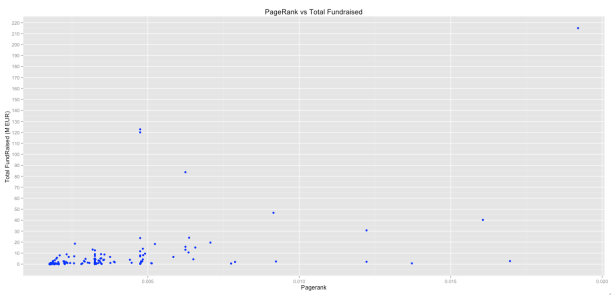
dublin_graph4  e) Degree and PageRank

By using Igraph for R, it’s possible to see the different connected components in the whole graph. This is an example:

dublin_graph5

 
Compamy Investor Type Investment Currency Year
sumup life-sreda venture 4030000 EUR 2014
sumup bbva-ventures venture 4030000 EUR 2014
sumup groupon venture 4030000 EUR 2014
sumup ta-venture undisclosed 0 EUR 2012
sumup bbva-ventures venture 0 EUR 2013
sumup groupon venture 0 EUR 2013
sumup klaus-hommels venture 4650000 EUR 2012
sumup tengelmann-ventures venture 4650000 EUR 2012
sumup shortcut-ventures-gmbh venture 4650000 EUR 2012
sumup brainstoventures venture 4650000 EUR 2012

Two charts that relate Funding with metrics like degree and pagerank.

degree_r

pagerank_r


Leave a comment

Next Stop Dublin: Public Libraries, Supermarkets and Voronoi Diagrams

I’ve been living in Dublin for only a couple of weeks and I’d like to write a post related to the city. In these few weeks I’ve visited some places that have surprised me pleasantly, as for example: The Trinity College Library with its “Book of Kells“, the huge Phoenix Park with its deers, and the Science Gallery and its interesting temporal exhibitions. In the surroundings of the city I visited the Celtic Boyne Valley (Trim castle included or “Braveheart” castle) and had the opportunity, for first time, to face the “Irish Bog” in the Seahan mountain near to Tallaght. So, I’d like to say simply I’m delighted with the city and its people. Moreover, it’s a very active city in IT issues with several meetups that worthwhile to consider such as: DublinR, Python Ireland, Hadoop User Group Ireland, DublinKind, and Big Data developers Dublin. A special mention is for Chapters Bookstore, a great find. collageDub Dublin Data As a newcomer to the city, I wanted to know where are located some key sites such as supermarkets or public libraries and therefore I got ready to build a map of locations with its respective Voronoi diagram in order to visualize the area of coverage or influence of each point. According to Wolfram MathWorld, a Voronoi diagram is “a partitioning of a plane with points into convex polygons such that each polygon contains exactly one generating point and every point in a given polygon is closer to its generating point than to any other. A Voronoi diagram is sometimes also known as a Dirichlet tessellation. The cells are called Dirichlet regions, Thiessen polytopes, or Voronoi polygons”. In order to find GPS coordinates in the case of the supermarkets I used a Python script to connect Yelp APIv2. I don’t know which is the problem with Yelp API, but I only could gather 1000 of 1153 points that Yelp search browser indicates and which 442 supermarkets are really in the Dublin city area. In the case of the public libraries I used “geopy” package, which geo-locates a query to an address and coordinates. In both cases, I must say there are some differences in the real position of some places, but as proof of concept, for me it’s OK. As Dublin City area I considered the five areas described in the city website:

  1. Central Area: This includes Broadstone, North Wall, East Wall, Drumcondra, Ballybough and the north city centre.
  2. North Central Area: This includes Kilbarrack, Raheny, Donaghmede, Coolock, Clontarf and Fairview.
  3. North West Area: This includes Cabra, Ashtown, Finglas, Ballymun, Santry, Whitehall, Glasnevin, the Phoenix Park and parts of Phibsborough.
  4. South Central Area: This includes Ballyfermot, Inchicore, Crumlin, Drimnagh, Walkinstown, The Liberties and the south west inner city.
  5. South East Area: This includes Rathmines, Rathgar, Terenure, Ringsend, Irishtown, Pearse Street and the south east inner city.

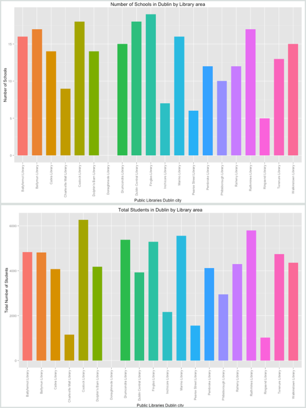
Additionally and as proof of concept again, by means of Dublinked (Open Data) and AIRO, I got two datasets with information about Primary and Post-Primary schools in Dublin city (census 2013-2014). My idea was for example to know how many students are studying in a particular area of the city or how many students are assigned, say, to a specific library (Voronoi polygon). In the case of Post-Primary schools dataset, school coordinates are in UTM coordinates, so it’s necessary to apply a transformation to GPS Coordinates (e.g. CRS(“+init=epsg:29902”) to CRS(“+init=epsg:4326”)). The datasets contain information (2013-2014) about school ethos or separation by gender but I was only interested in total values. In this Github, you can find kml and csv files. Some example:

library(deldir)
library(ggplot2)
library(ggmap)
library(sp)
library(rgdal)
library(maptools)

#Load data with GPS coordinates for Public Libraries in Dublin City 
df <- read.csv("t_lib.csv",header = TRUE, sep = ",",stringsAsFactors=FALSE)

# Voronoi data
vor <- deldir(df$long, df$lat)

# Creating Voronoi polygons
w = tile.list(vor)
polys = vector(mode='list', length=length(w))
for (i in seq(along=polys)) {
 pcrds = cbind(w[[i]]$x, w[[i]]$y)
 pcrds = rbind(pcrds, pcrds[1,])
 polys[[i]] = Polygons(list(Polygon(pcrds)), ID=as.character(i))
 }
SP = SpatialPolygons(polys)
voro = SpatialPolygonsDataFrame(SP, data=data.frame(x=df$long,y=df$lat, row.names=sapply(slot(SP, 'polygons'), function(x) slot(x, 'ID'))))

#Generating DataFrame with polygons
pvor1=data.frame()
for (i in seq_along(voro)){
pvor2=SP@polygons[[i]]@Polygons[[1]]@coords[,1:2]
pvor2=as.data.frame(pvor2)
pvor2$ID<-df$name[i]
pvor1<-rbind(pvor2,pvor1)
}

#Ploting: Points, Polygons and Segments
dub_map <- get_map(location = "Dublin", zoom = 11)
ggmap(dub_map) + geom_point(aes(x = long, y = lat), data = df, colour = "blue", size = 3)+
geom_polygon(aes(x=V1, y=V2,group=ID,fill=ID),data=pvor1, alpha=0.3)+
ggtitle("Voronoi Polygons for Public Libraries in Dublin City")+geom_segment(
 aes(x = x1, y = y1, xend = x2, yend = y2),
 size = 1,
 data = vor$dirsgs,
 linetype = 1,
 color= "#FFB958")

Voronoi_Dublin In this RPubs you can find the RMarkdown file. Other plots. PS: Donaghmede Library has zero students because this library is out of Dublin City area according to the boundary defined (North Central kml), so surrounding schools were filtered. plot1_1 plot1 plot2 plot3 plot_schools_dens Also it’s possible to generate kml files for points, polygons and segments and put into googlemap.

Comments:

I’d like to comment that “deldir” R package uses the Lee and Schachter’s algorithm for Delaunay Triangulation; however, it’d be interesting to apply an algorithm (e.g. modifying Fortune’s algorithm, etc) that allows generating, say, a weighted Voronoi diagram since in the reality each library has different resources and opening hours and so it’s possible to use other metrics, beyond Euclidean distance. In fact, an interesting next step would be to review “Power diagrams” which are a generalization of the Voronoi diagrams.

As last comment, I want to recommend the book “Longitude” written by Dava Sobel. I know it’s old (1995), but that is also one of the reasons why I wrote this post; it was a kind of inspiration. Well, in short, it’s a true story of a lone genius who solved the greatest scientific problem of his time: measuring the longitude in the sea. It’s a story with a clear scientific background where it’s possible to learn different concepts related to navigation and geography. Moreover, it’s a story of overcoming and how jealousy, egos and ignorance complicate the scientific progress.