Just a couple of weeks ago I read an interesting article in Scientific American (Feb 26) about the Kepler mission and the search of the extrasolar planets or exoplanets. This report talked about the number of exoplanets validated to date by Kepler Telecope Team: 715 exoplanets; a revealing number since the mission was just launched in 2009 and in 2012 stopped taking data for technical glitches. It’s clear that all this is a promising fact because to date only a negligible zone of de Universe has been explored within a short time. There are many planets that remain undiscovered, although the most important thing is to find planets with habitability conditions. In this sense other approach that now comes to my mind is the Phoenix Project (SETI) devoted to extraterrestrial intelligence search based on the analysis of patterns in radio signals. In 2004 however, it was announced that after checking the 800 stars, the project had failed to find any evidence of extraterrestrial signals. In any case, all these attempts have huge value to improve our knowledge about the Universe.
Also, two weeks ago, in a boring Sunday, I bumped into a TV show called “How the Universe works: Planets from Hell” (S02E03, Discovery Max). It explained the features and conditions of the planets detected to date: most of them were gas giants and massive planets; i.e. new worlds with extreme environments in both senses: cold and heat, which make impossible life as we know it. However, an interesting concept called “Circumstellar habitable zone” (Goldlocks zone) was mentioned, which corresponds to a region around a star, neither too cold nor too hot, where are orbiting planets similar to the Earth. A shared particularity among them is that they can support liquid water, which is an essential ingredient necessary for life (as we know it). Continuing with this idea, other concept emerged: “Earth Similarity Index” (ESI), although it isn’t a measure of habitability, is at least a reference point because it measures how physically a planetary mass object is similar to the Earth. ESI is a formula that depends on the following planet parameters: radius, density, escape velocity and surface temperature. The output of the formula is a value on a scale from 0 to 1, with the Earth having a reference value of one.
Also, in the same TV-show, Michio Kaku, an outstanding theoretical physicist, I remember he said: “that science fiction writers of the 50s had fallen short in the description of these strange worlds and where clearly the reality has exceeded the fiction”. In this point, I would like to remind an amazing book “The Face of the Deep” (1943) written by Edmond Hamilton where “Captain Future” (my childhood hero, I admit it, specially his Japanese cartoon) along with a group of outlaws fall to a planet at the verge of extinction. Actually, this “planetoid” was in the Roche’s Limit, i.e. the closest that a moon (or a planetoid in this case, say) can come to other planet more massive without being broken up by the planet gravitational forces. It lies at about 2 ½ times the radius of the planet from the planet’s centre. Well, better to go to the source as a tribute:
“He swept his hand in a grandiloquent gesture. “Out there beyond Pluto’s orbit is a whole universe for our refuge! Out there across the interstellar void are stars and worlds beyond number. You know that exploring expeditions have already visited the worlds of Alpha Centauri, and returned. They found those worlds wild and strange, but habitable.
The Martian’s voice deepened. “I propose that we steer for Alpha Centauri. It’s billions of miles away, I know. But we can use the auxiliary vibration-drive to pump this ship gradually up to a speed that will take it to that other star in several months.
Two months from now, this planetoid will be so near the System that its tidal strains will burst it asunder. Roche’s Limit, which determines the critical distance at which a celestial body nearing a larger body will burst into fragments, operates in the case of this world let as though the whole System were one great body it was approaching.
The fat Uranian’s moonlike yellow face twitched with fear, and his voice was husky. “It’s true that Roche’s Limit will operate for the whole System as though for one body, in affecting an unstable planetoid like this. If this planetoid gets much nearer than four billion miles, it will burst”.
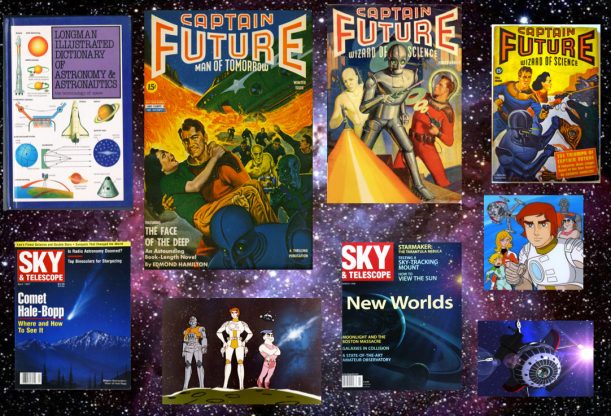
My childhood memories and my old astronomical dictionary (by Ian Ridpath). Now, there exists a modern version called Oxford Dictionary of Astronomy (2012).
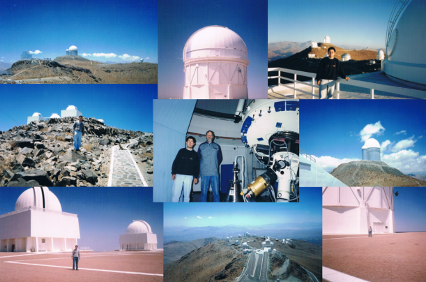
Continuing with my memories, I must say Astronomy has been always a very interesting topic to me, even more during my engineering student days, where I was fortunate to work as a summer intern in Electronic Lab at two main observatories in Chile: ESO-La Silla Observatory in 1995 and Cerro Tololo Inter-American Observatory in 1996. On the other hand, I also worked in a university project for the development of an autoguider system for a telescope, i.e. an electronic system that helps to improve astrophotography sessions in order to get perfect round stars during long exposure time. For this, I still remember to work with different elements such as CCD image sensor TC-211 (165 x 192 pixels, today, it’s a joke), programming microprocessors via Assembler, a Peltier cell as a cooling system, and a servomotor controller for an equatorial mount, among other things.
With all this, at that time, I felt like an amateur astronomer or at least an Astronomy enthusiast. However, looking back, now I have the feeling that an amateur astronomer in 1995 or 1996 was only able to take astronomical photos and maybe then to apply some filtering technique (e.g. Richardson-Lucy algorithm) to improve the image, or inclusive a person could make a homemade telescope with a robotic dome, etc. In this sense, I remember some amazing reports from Sky & Telescope magazine (I was subscribed five years, I recommend it) where people shared their experiences in astrophotography, gave tips about telescopes construction, and sometimes some “visionary” came into stage, teaching how to make a spectrograph with fiber optic, for example or another advanced technique. But beyond this, I don’t remember any remarkable report related to astronomical data analysis made by an amateur.
At that time, I know Internet didn’t have the development that currently has, also it’s true that available technical resources were scarce, and external information from astronomical organization was minimal or non-existent; I mean astronomical open data. Well, unfortunately after many years of being disconnected to Astronomy, I have newly discovered a “new world” thanks to many astronomical organizations have opened their databases enabled APIs, and where any person can download an astronomical file or, even, there are websites that include powerful analysis tools. Surely, someone can tell me, it isn’t novel and surely also he/she is absolutely right, but at least for me it’s a real discovery due to today I spend my time analyzing data, all this is really a gold mine and a great opportunity to continue with my hobby. By using tools like Python or R, it’s possible extract interesting information, for example, about exoplanets or another astronomical object of interest, and therefore, any person can contribute even more to enrich and expand the general knowledge in Astronomy. However, in spite of how challenging is to analyze data “from scratch and from my home”, to look at a starry night is an incomparable sensation to anything, especially in the Southern hemisphere (Atacama desert) with the Magellanic Clouds.
In Python there exist many packages and libraries associated to astronomical data analysis. AstroPython for example, is a great website where it’s possible to find different resources from emailing-lists or tutorials to Machine Learning and Data Mining tools like AstroML, whose authors also recently (January 2014) published an excellent book called “Statistics, Data Mining, and Machine Learning in Astronomy: A Practical Python Guide for the Analysis of Survey Data” (2014) by Zeljko Ivezic et al. Moreover in R there is a similar book called “Modern Statistical Methods for Astronomy: with R Applications “ (2012) by Eric D. Feigelson and G. Jogesh Babu. In general, many astronomical data are in FITS (Flexible Image Transport System) format and once you decode them, say, you can use any programming language (e.g. Python, C, Java, R, etc.) and any Machine Learning tool such as: Weka, Knime, RapidMiner, Orange or directly via Python (by using Scikit-Learn and Pandas) or R scripts (here, I also recommend RStudio).
Well, coming back to initial topic “explanets”, I would like to share some things that you can make with astronomical open data and Python, but previously I would like to comment some things about exoplanets.
A brief glance at Exoplanets
As mentioned before, Kepler Mission was launched in 2009 and from that moment till 2012 sent valuable information about possible exoplanets. Kepler satellite orbits the Sun (not Earth orbit) points its photometer to a field in the northern constellations of Cygnus, Lyra and Draco. In NASA Exoplanet Archive is possible to find much information about mission, technical characteristics, current statistics, and as well as access to interesting tools for data analysis.
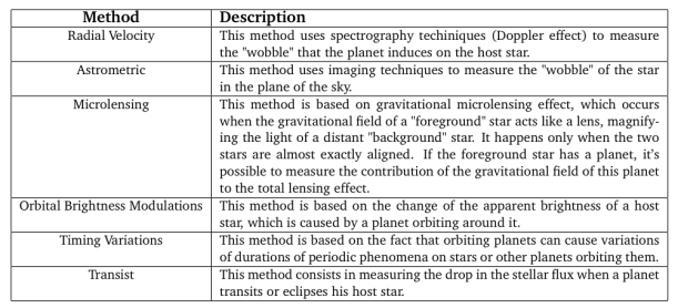
I merely want to add that there are mainly two methods for detecting explanets: direct method and indirect method. The former is simply based on the direct observation of a planet i.e. direct imaging. It’s a complicated method because, as we know, a planet is an extremely faint light source compared to star and this light tends to be lost in the glare of the host star. In the case of indirect method, it consists in observing the effects that the planet produces (or exhibits) on the host star (see Table).
As it can be seen in the following figures, Transit method based on light curves is currently the most common technique used in exoplanets detection. A light curve is simply an astronomical time series of brightness of a celestial object over time.Light curve analysis is an important tool in astrophysics used for estimation of stellar masses and distances to astronomical objects. Additional information in these links: Link1, Link2 and Link3.
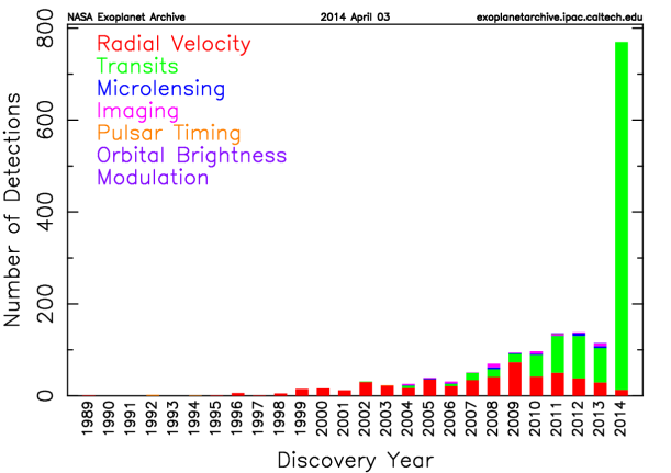
Number of Exoplanet detected to date (Source NASA)
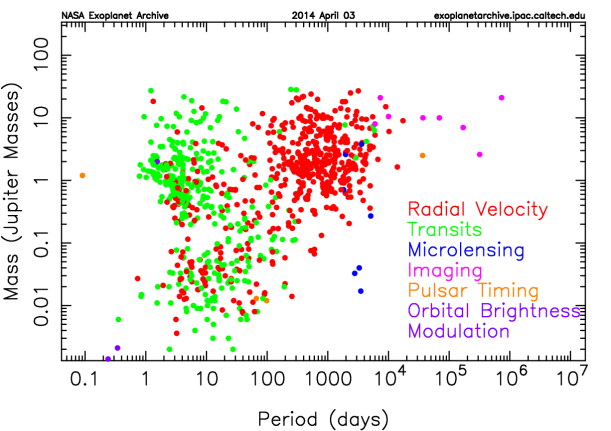
Mass of the detected planets with regard to Jupiter (Source NASA)
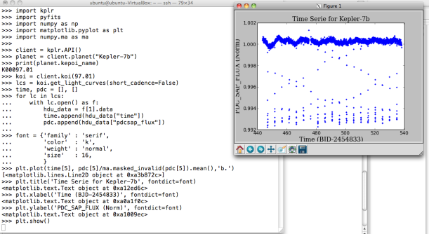
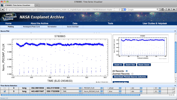
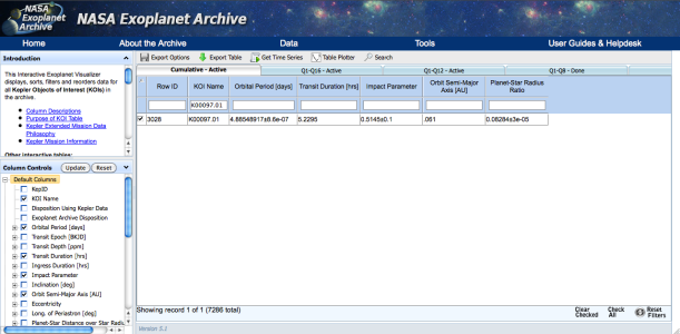
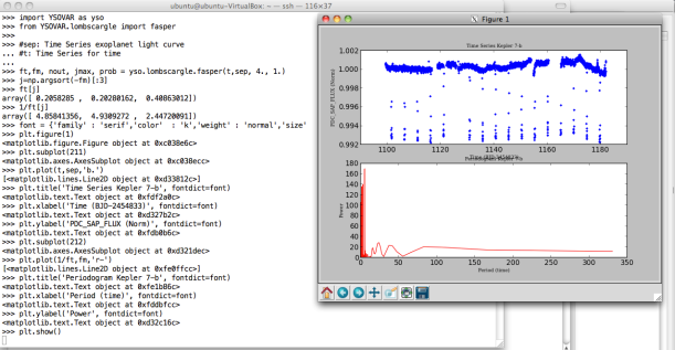
On MAST Kepler Public Light Curve website it’s possible to download light curves from Kepler Mission as tarfile or individually in FITS format for different quarters and type of cadence period. However, for easier access, I recommend to use Python packages such as Klpr and PyFITS . The following figure shows a simple example on how to get light curves for confirmed exoplanet Kepler-7b (KepID: 5780885, KOI Name: K00097.01, Q5, long cadence (lc) and normalized data). Also you can use NASA Exoplanet Archive tools to visualize the data. A light curve contains different data columns (see more detail here) but, in this example, I only used the following parameters:
- TIME (64-bit floating point): The time at the mid-point of the cadence in BKJD. Kepler Barycentric Julian Day is Julian day minus 2454833.0 (UTC=January 1, 2009 12:00:00) and corrected to be the arrival times at the barycenter of the Solar System.
- PDCSAP_FLUX (32-bit floating point): The flux contained in the optimal aperture in electrons per second after the PDC (Presearch Data Conditioning) module has applied its detrending algorithm to the PA (Photometric Analysis module) light curve. Actually, it’s a preprocessed and calibrated flux. Generating light curves from images isn’t trivial process. First it’s necessary calibrate the images because there are many systematic source of errors in the detector (e.g. bias and flat field). Next, it’s needed to select reference stars and correcting for image motion and then to apply some method like aperture photometry. It’s to be welcomed that in this case everything is OK.
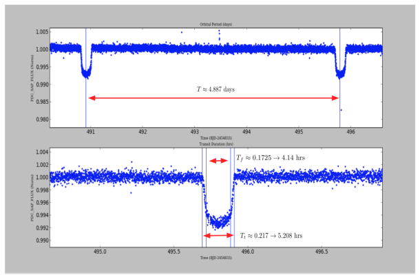
Now, given these light curves, you can to get interesting data about exoplanets just “from the plot” as proof of concept. However, I used only one curve in a specific quarter and cadence, but actually it’s necessary for more accuracy (and statistical rigor) to use many light curves in the measurement. Anyway, by using the same example, Kepler-7b light curve (Q5, lc), we can approximately estimate: Orbital Period (T), Total Transit Duration (T_t), Transit Flat (T_f, duration of the “flat” part of the transit), and Planet-Star radius ratio. The latter can be also calculated by using the phase plot, i.e. flux vs phase. In Python simply you can use “phase=(time % T)/T” and to create a new column in your DataFrame.
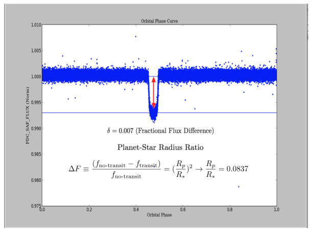
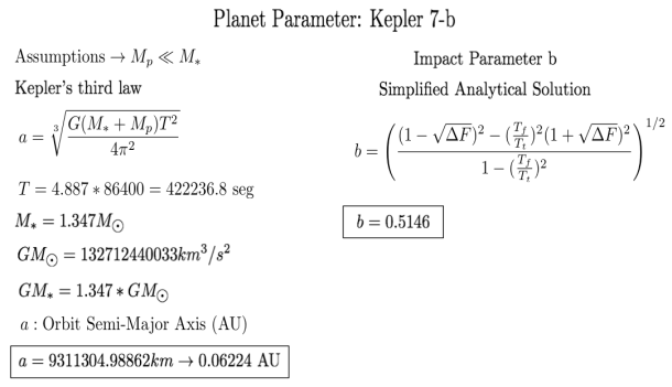
So, by applying some assumptions and simplifications from “A Unique Solution of Planet and Star Parameters from an Extrasolar Planet Transit Light Curve (2003) by S. Seager and G. Mallé́n-Ornelas, we can get additional parameters such as “a” (Orbit Semi-Major Axis) or Impact Parameter “b”. By means of using other formulas it’s possible to find stellar density, stellar mass-radius relation, etc.
Machine Learning for Exoplanets
As initial point, I would like to mention an interesting project called PlanetHunters, which is a citizen-driven initiative from ZooUniverse project launched in December 16, 2010 to detect exoplanet from light curves of stars recorded by Kepler Mission. It’s a tool that exploits the fact that humans are better at recognizing visual patterns than computers. Here, each user contributes with his/her own assessment indicating whether a light curve shows evidence of the presence of a planet orbiting the star.
Classifying a light curve isn’t an easy task. For example, a little planet could be undetectable because its effect in the dip of the light curve is imperceptible. Many times, variations in the intensity of a star are due to internal star processes (variable stars) or for the presence of an eclipsing binary system, i.e. a pair of stars that orbit each other. In this sense, it’s worth mentioning that a light curve associated to the transit of an exoplanet will be a light curve relatively constant, with certain regularity, and with small dips corresponding to the transit.
In fact, NASA defines three categories in Kepler Objects of Interest (KOI): confirmed, candidate and false positive. According to them, “a false positive has failed at least one of the tests described in Batalha et al. (2012). A planetary candidate has passed all prior tests conducted to identify false positives, although this does not a priori mean that all possible tests have been conducted. A future test may confirm this KOI as a false positive. False positives can occur when 1) the KOI is in reality an eclipsing binary star, 2) the Kepler light curve is contaminated by a background eclipsing binary, 3) stellar variability is confused for coherent planetary transits, or 4) instrumental artifacts are confused for coherent planetary transits.”
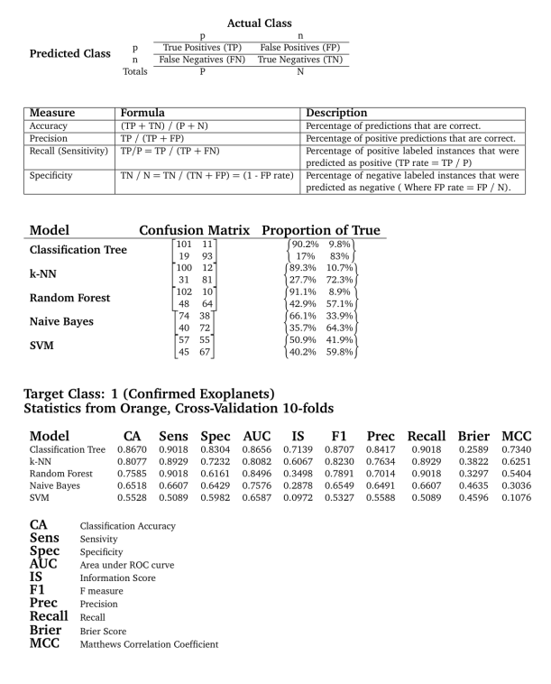
Taking as inspiration the paper called “Astronomical Implications of Machine Learning” (2013) by Arun Debray and Raymond Wu, I decided to try some ML supervised models to classify light curves and determine whether these correspond to exoplanets (confirmed) or non-exoplanets (false positive). As a footnote: All this is just a “proof of concept”. I don’t intend to write an academic paper and my interest is only at hobby level. Well, I selected 112 confirmed exoplanets and 112 false positives. I just considered the parameters PDCSAP_FLUX and Time from each light curve by using Q12-lc and normalized data. Here, a key point is to characterize a light curve in term of attributes (features) that allow its classification.
According to Matthew Graham in his talk “Characterizing Light Curves” (March 2012, Caltech), “light curves can show tremendous variation in their temporal coverage, sampling rates, errors and missing values, etc., which makes comparisons between them difficult and training classifiers even harder. A common approach to tackling this is to characterize a set of light curves via a set of common features and then use this alternate homogeneous representation as the basis for further analysis or training. Many different types of features are used in the literature to capture information contained in the light curve: moments, flux and shape ratios, variability indices, periodicity measures, model representations”.
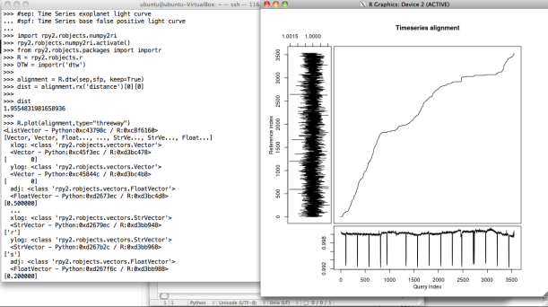
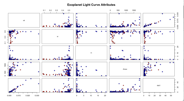
In my case, I simply used the following attributes: basic dispersion measures (e.g. percentile 25/50/75 and standard deviation), shape ratio (e.g. fraction of curve below median), periodicity measures (e.g. amplitudes, frequencies-harmonics, and amplitude ratios between harmonics by means of the periodogram based on Lomb-Scargle algorithm), and distance from a baseline light curve (false positive) by using Dynamic Time Warping (DTW) algorithm.
For getting periodogram, I used the pYSOVAR module and the Scipy Signal Processing module. According to Peter Plavchan, “A periodogram calculates the significance of different frequencies in time series data to identify any intrinsic periodic signals. A periodogram is similar to the Fourier Transform, but is optimized for unevenly time-sampled data, and for different shapes in periodic signals. Unevenly sampled data is particularly common in Astronomy, where your target might rise and set over several nights, or you have to stop observing with your spacecraft to download the data”. Moreover, for DTW, I used the mlpy module. Alternatively, it’s also possible to use R scripts over Python by using the Rpy2 module. Regarding to this topic, in the paper called “Pattern Recognition in Time Series” (2012), Jessica Lin et al. mention: “the classical Euclidian distance is very brittle because its use requires that input sequences be of the same length, and it’s sensitive to distortions, e.g. shifting, along the time axis and such a problem can generally be handled by elastic distance measures as DTW. DTW algorithm searches for the best alignment between two time series, attempting to minimize the distance between them”. For this reason, distance DTW could be a interesting metric to characterize a light curve. Finally, two examples for periodogram and DTW.
After generating a DataFrame and creating a csv file (or .tab), I used Orange tool to apply different classification techniques over the dataset. At this point, as I said above, there are many tools that you can use. Also, I tested available classifiers on the dataset by using 10-folds cross-validation scheme. Previously, it’s possible to see some relationships between attributes such as: sd (standard deviation), sr (shape ratio), f1 (maximum frequency in periodogram) Amax (maximum amplitude periodogram), and dist1 (DTW distance). Shape ratio, as we see, is an attribute that can give advantage in the task of classification because it would allow a clearer separation of classes.
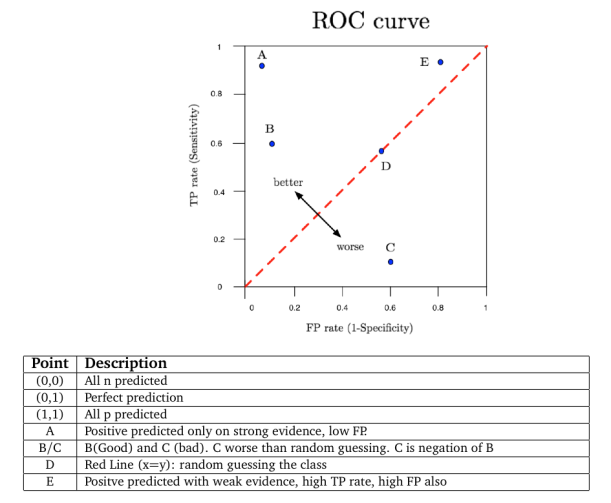
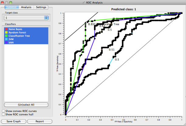
As first approach, I used 5 basic methods: Classification Tree, Random Forest, k-NN, Naïve Bayes and SVM. The results are presented in the following tables and plots (ROC curve). There are a large variety of measures that can used to evaluate classifiers. However, some measures used in a particular research project may not be appropriate to the particular problem domain. Choosing the best model is almost an art because it‘s necessary to consider the effect of different features and operating condition of the algorithms such as type of data (e.g. categorical, discrete, continuous), number of samples for class (e.g. large or little difference between classes which can impact in the classification bias), performance (e.g. execution time), complexity (to avoid overfitting), accuracy, etc. Well, in order to simplify the selection and taking into account for example CA and AuC, Classification Tree, Random Forest and k-NN (k=3) are the best options. Also, applying performance formulas over Confusion Matrix it’s possible to reach this obvious conclusion. Moreover, according to literature an AuC value between 0.8 and 0.9 is considered “good” so that three methods are in the range. By the way, for more detail how Orange calculates some index, I recommend to read this link. As final comment, it’s true, however, that a more detailed study is needed (e.g. statistical test, new advanced models, etc.), but my intention was only to show that with a few scripts could be possible to do amateur Astronomy of “certain” quality.


 Perhaps, a Sankey diagram could be suitable to represent the connections between companies and investors because the width of the arrows is proportional to the investments which give us a clear idea about flow investment in Dublin. However, they are many companies and investors and the whole diagram is a bit confusing, so I only show a couple of companies/investors. By the way, this type of diagram is mainly used to visualize energy or material or cost transfers between processes. Here there is a javascript chart.
 Some Results:
 e) Degree and PageRank


